ALRIGHTY KIDS! Let’s talk about this house.
I’ve been pretty open about the fact that I’ve never really decorated a home before. We’ve always just kind of thrown things together and called it a day. And turns out… decorating a house can be PRETTY overwhelming! So I’ve been doing all sorts of research and talking with friends who’ve done this before. One of the top tips I learned from my friend Elsie was to come up with a “color story” for your home. That means, coming up with a set of colors, textures and patterns that you can work within for the majority of your home. It allows you to narrow your focus and ensure that everything feels cohesive as you flow through the house. Can there be exceptions? Sure! But it’s really helped us to have a starting point such as this.
So today, I wanted to share a bit about the color palette and overall vibe we’ve chosen for the house! I’ve been collecting inspiration on this board since we bought it but put together a mood board as well that really exemplifies our goals with the home. Let’s chat!
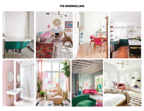
Sources: Green Tub via Domino, Boucherouite Rugs via SF Girl By Bay, Pink Dining Chairs via Pinecone Camp, Kitchen via Design*Sponge, Pink Bathroom via Rebecca Judd Loves, Colorful Windows via Emily Henderson, The Fig House by Emily Henderson, Bedroom by Hamlet Interiors via Lonny Mag
DO YOU LOVE IT AS MUCH AS I DO!?!?!
Here’s what I’ve learned thus far about my style:
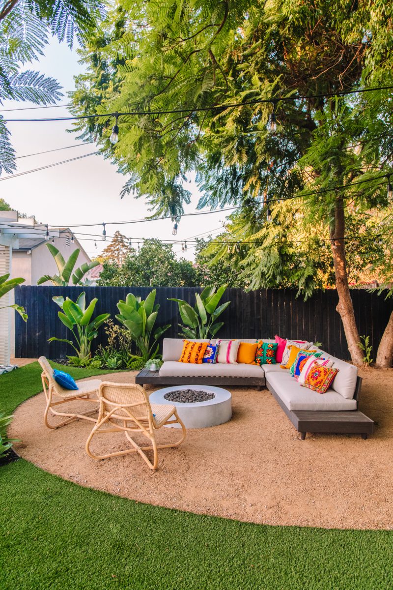
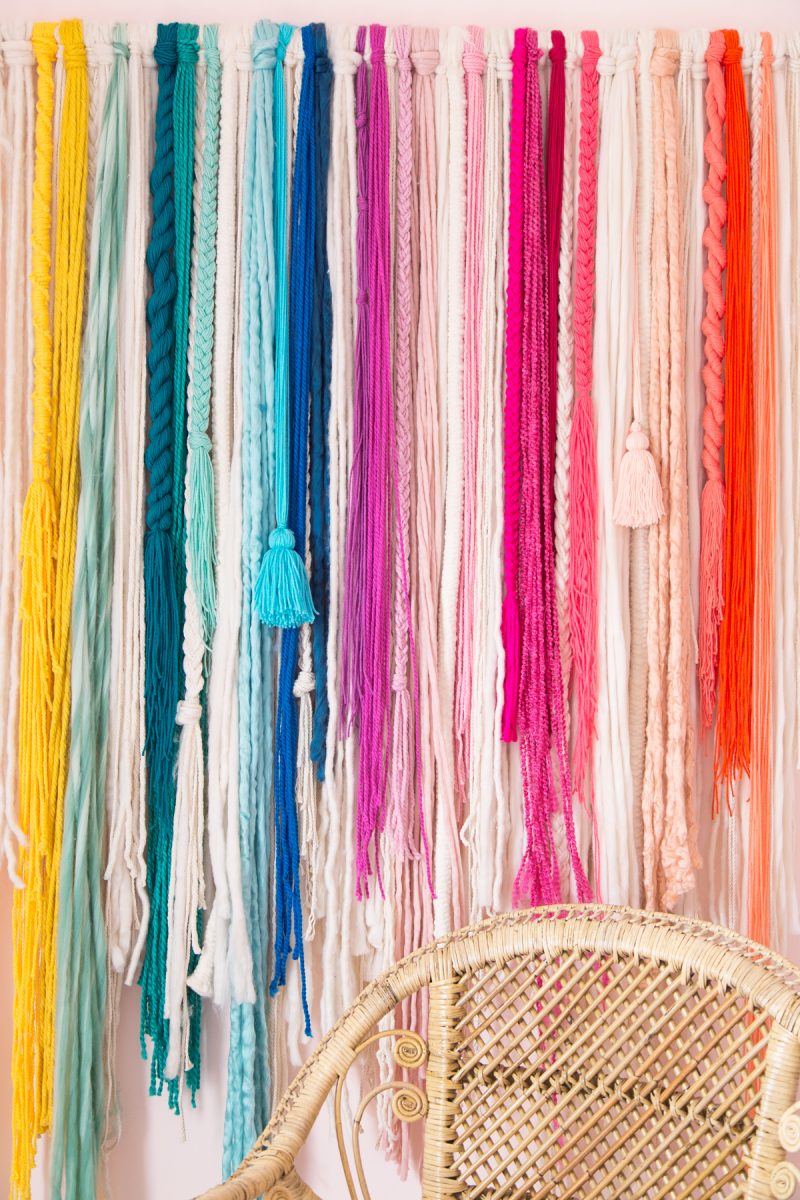
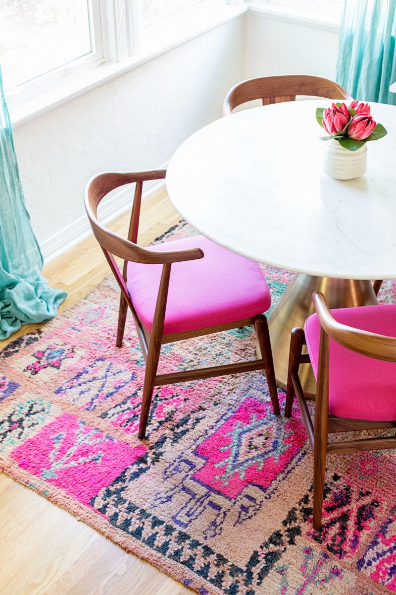
– I really gravitate to natural elements in the home. I love textured moroccan rugs, baskets, rattan and weavings. I think it makes my personal style err more bohemian than my “brand’s” style, which might be unexpected to some of you!? But that room up there, top row second from the left… with all the rugs and that mirror and that chair! DIE DIE DIE.
– We really love white walls. That was a recurring theme in my selections. Almost every room I liked had white walls and then layers and layers of color within the furniture, rugs and artwork.
– I hate gray. There are few colors that are completely banished from our home, but that is one of them. I much prefer creams and natural hues for our “neutral.”
– We like a lot of different styles and love the contrast they create when combined. i.e. Clean, modern light fixtures against rich textures, or the very modern bed picked out with rattan nightstands flanking it.
– We both like pink. I know I’ll get questions about this, but we do! In fact, since I know I always err on the side of pink, I run every decision by Jeff and he almost always prefers/likes the pink options! Gosh, I love him.
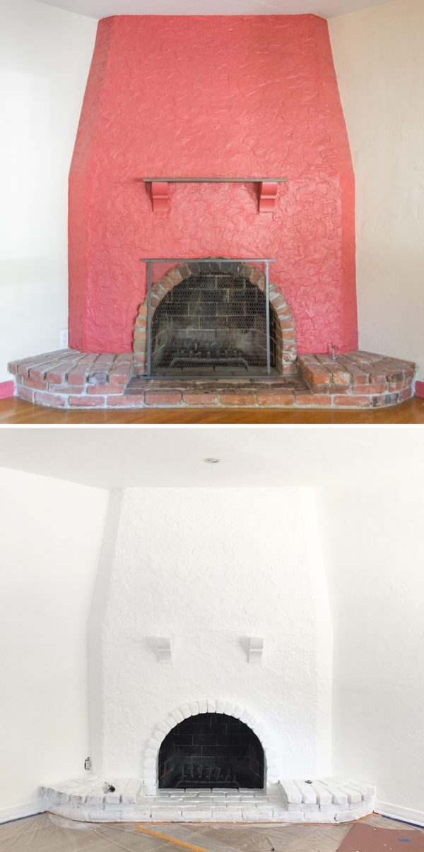
Exhibit A for why I love white walls as a base for everything. Look at the difference!!
And here’s how we determined our palette:
Once I had pulled together this mood board and Jeff and I agreed on everything, we wanted to pull together our color palette. This was the fun part!!!!
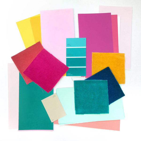
We went to our local paint store and pulled a bazillion paint swatches. Then we came home and laid all the colors out on the table to select our final ones. While we knew we wanted white walls primarily, doing this allowed us to visualize the whole house palette even if we weren’t using all the colors for paint. We each got to go through our pick our top faves, and then veto ones we didn’t like from each others selections.
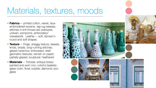
A few weeks after we did this, Dunn Edwards had reached out to share their 2018 Color Trends Report. As a former fashion school student, I love nothing more than a trend report!!!!! I started digging through it and noticed a lot of similarities between our mood board and two of their trends: The Stars, which had lots of bright pops of color like our color palette, and Natural Wonders, which felt like our ideal home with velvet, pom poms, tassels, brass, colorful baskets and scallop motifs. You can see a snippet of each below and check out the full report here! It’s fascinating.
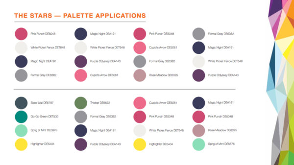
As it turned out, some of the colors we had already picked out were actually key colors from the trend reports (not joking!!) like Highlighter (that’s what we used for Arlo’s door!) and Go-Go-Green.
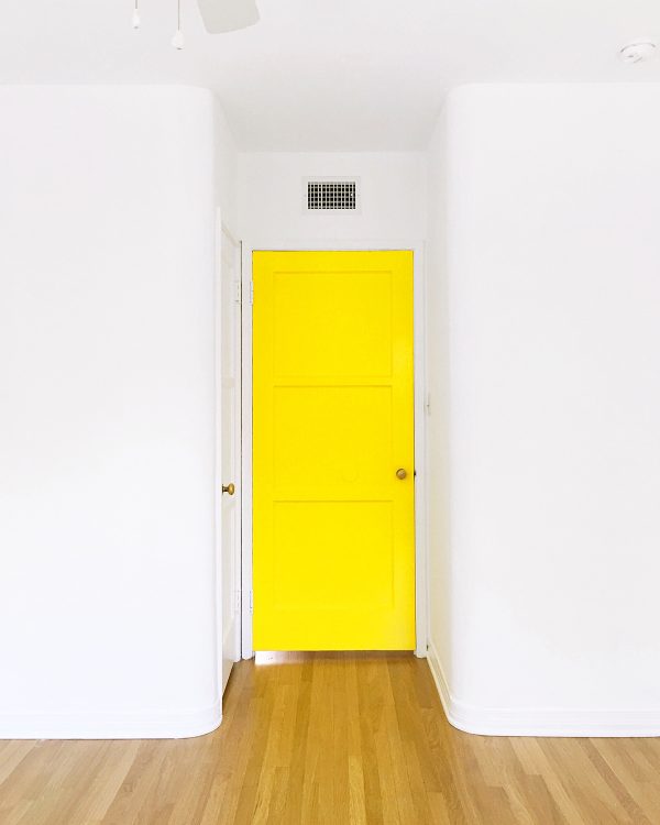
As if it was fate! Ha! We knew Dunn Edwards would be the perfect partner for the house so we’re super excited to be working with them!! They set us up with one of their color experts at our local store to help us select our final white paint. (We ended up with their standard “White”, with “Igloo” as a close second!) And she also thought of unique ways for us to use colorful paint, like on doors, in our fireplace and on lower kitchen cabinets. (I’m gonna be asking your opinion on our pink front door options soon, so stay tuned to Insta stories for that!) Below, you can see one of the mockups she did for us to show how we could add a pop of color to the interior of our fireplace since it’s not a functioning fireplace.
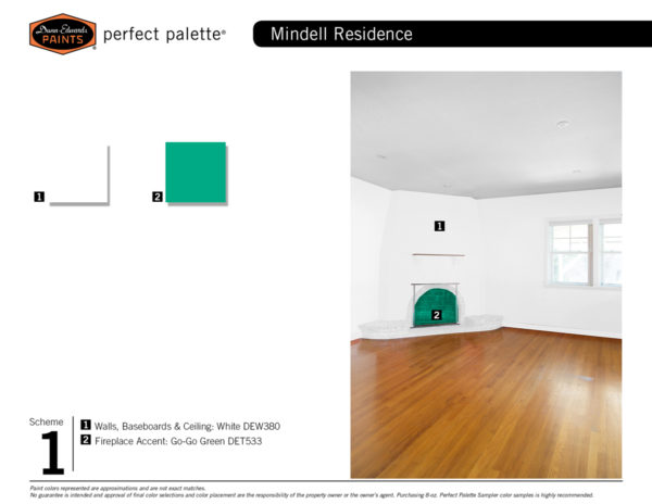
I highly recommend doing this color palette exercise if you’re working on decorating a new home! It was so helpful to see what colors Jeff and I each gravitated to and which ones we agreed on. It also helped to know what we hated. We’ve been taking those paint swatches with us everywhere, and have since picked out fabric and tile accordingly.
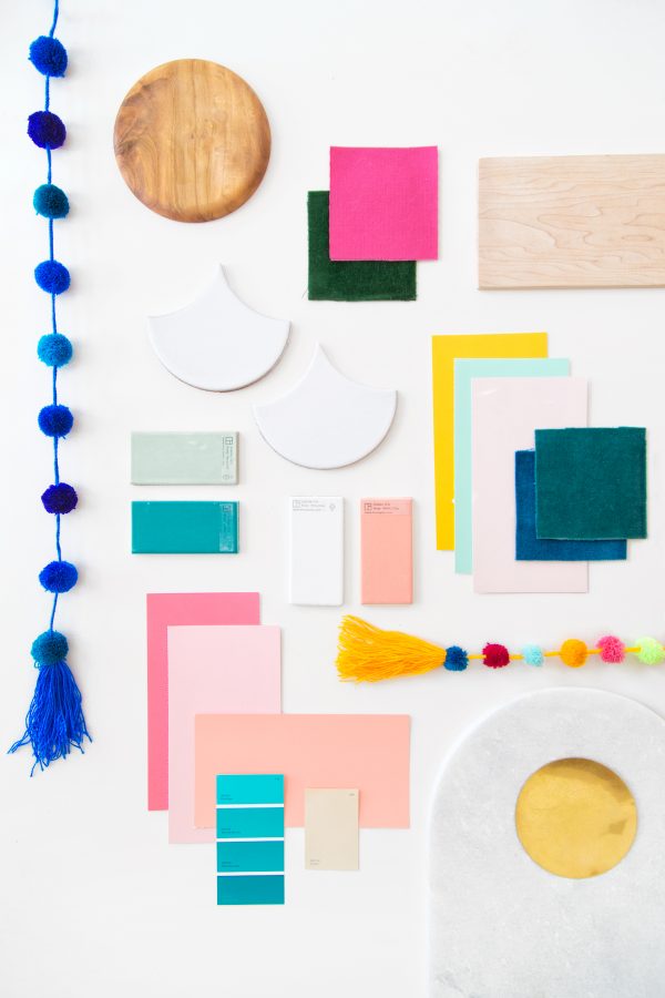
So the final verdict?
Colors: Blushes, hot pink, peach, mint, teals, yellow, creams and tans, and of course white. (The Dunn Edwards paint colors pictured above from top to bottom, left to right are: Highlighter, Faint Clover, Pink Theory, Cupid’s Arrow, Sweet Sixteen, Amber Tide, Reef Encounter and Cameo.)
Finishings: Brass, Marble, Quartz, White
Tile and Wood Surfaces: Natural on the floors, walnut for the furniture, scallop tiles, pops of color in the bathroom (The tile pictured above is from Fireclay! We’ll be working with them on our first renovation coming up soon!! Above is there ogee drop and tile colors are Atlantic, Fluorite, Calcite and Stilbite)
Fabrics + Textures: Woven moroccan rugs, rattan, linen, velvet and for the more trafficked pieces… something that holds up to baby drool? Ha! TBD, any advice??? (The swatches pictured above are from Room & Board, who we’ll be working with on some furniture for our bedroom and dining room!)
Style: I still struggle to define my style (Anyone wanna take a stab at it? Comment below!) but it’s something along the lines of colorful eclectic meets California boho with a touch of mid century modern? LOL.
So there you have it! The future Mindwelling! I am BEYOND excited to bring it to life and document it here!!! I’m sure I’ll be asking your opinions a LOT because making this many decisions is not going well for me. Ha! But what do you think!? I’m curious, is this what you expected our home to look like or is it totally different??
A huge thank you to Dunn Edwards for providing the paint for our home. All opinions are that of my own!




Mandy says
I noticed that at least two of your mood board rooms are from blogger/designer Emily Henderson (bottom row, middle two – her old office and the Fig House). You two partnering would be my dream team!!! She also did a round up of ‘kid friendly’ sectionals that might be helpful for the drool resistant fabric needed. Good luck and I’m excited to see your home unfold!
https://stylebyemilyhenderson.com/blog/58-kid-friendly-sectionals
Kelly says
I love Emily and her work!! And thank you for the kid friendly sofa link!! MUCH needed right now!! Our current sofa has been completely destroyed!
Melissa says
“I still struggle to define my style (Anyone wanna take a stab at it? Comment below!) but it’s something along the lines of colorful eclectic meets California boho with a touch of mid century modern?”
Haha, I know that feeling. I have heard “happy modern” used to describe my style. I’ve also used “mid century dollhouse” and “modernist cute” in reference to our home. If I were to describe you and Jeff to a friend, I’d probably say that you, your lives, and your style were “bright chic” or “crisp and colorful.” You’re playful but not juvenile.
Kelly says
Ooooh love all these! “mid century dollhouse” is hilarious!! Love bright chic too.
Michelle says
This is so exciting, I am so looking forward to seeing this put into action!
https://www.makeandmess.com/
Kelly says
Thanks Michelle!! So excited!
Kristina B says
I shall declare my stab: ISLAND LUXURY. Like a gorgeous beach house but one that costs like three grand to stay in, not that has heinous dried out sand-dollars in a bowl by the sink action.
It stands out like an oasis but still has touches of its natural surroundings.
Ok so I LOVE your color palette and I can’t WAIT to see what you do with it. Like DYING over all the pinks, mints, and blushes (obviously) and COBALT! Cobalt has definitely become a neutral for me lately.
SQUEE-ING WITH EXCITEMENT OVER HERE!
Kelly says
Ahaha! We may not have dried out sand-dollars but we WILL have 80s shell soap! 😉 Glad you love the color palette as much as I do!!!!
Kristina B says
Well YEAH but those are a design STAPLE. Like lightswitches.
Lauren H says
I would like to name your style: Mod California Hippie 🙂 I love love love the colors and the textures – excited to follow along as everything comes together!
Lisa says
I completely agree! As a Midwesterner, it screams “California!” to me (bright, airy, relaxed) with a touch of Boho and MCM.
Kelly says
Love!! It’s so funny how quickly we’ve left our Jersey roots and jumped on the California vibe bandwagon! 😉
Hester says
That looks amazing! When I saw your insta story I immediately thought blush&mint 😊 The colour mood board looks lush! How nice as well to be at the beginning of your home makeover, the prep and deciding on colour scheme is always my favourite time in the whole reno process.
If you set yourself certain colours to work with you can play around with style but the house will still look coherent. My style is very Scandinavian but in some of the rooms I do love Nomad and Rustic style elements too. As long as I stay in my white/blue/natural wood/grey olive colour palette all is good! Have a great time decorating can’t wait to see the results! Xx
Kelly says
Such a good point, Hester!! Jeff and I both love so many styles so I’m hopeful that this will tie our eclectic tastes together. Your house sounds amazing!!
Cinzia says
Beautiful, I like all the colors and the textures. I note the idea to make a mood board.
I prefer white walls too. First, in our house, we put some colors on the walls but, quickly, we got tired of them.
In the next apartment we will have white walls and colored furniture, cushions, etc. So if we do not like a color anymore it will be cheaper and easier to change haha.
Lee Lo says
I am collecting some pieces of inspirations for a year now. Thank you fro sharing yours!
Catherine Sarlis says
I love that you have figured out your style! When we first got our house (alllllmost 2 years ago) I felt this rush to get things done, like I had some sort of deadline. Did my fiancé (now husband) pressure me into making decisions? Did I put this pressure on myself? I’m not even sure. Anyway…. I ended up buying a bunch of stuff and painting the house gray. Like, practically every single room is gray! I thought I wanted neutral so I could add colors, but I pretty much hate everything in my house now. I actually want to go back, room by room, and fix everything to create a nice, cohesive home. I think part of my gray decor stems from my husband’s neutral-ness. Any time I pick something in a wild color, he questions it. Then I second guess it and go for the neutral, usually gray or black. P.S. … I HATE black furniture!
Amanda says
Yay! I love that you love white walls! I’ve only ever lived in apartments in my adult life so far and both times I chose to paint them white. Everyone told me I was boring but I’m like you, I’d rather bring the colour out with furniture and accessories. I think white brightens a home!
Abbey Kobylinski says
OMG- Please help me! I want to find a pom pom tassel thingie like your blue one for my kitchen! Where did you find yours? What do you search on etsy to get that kind of vertical pom pom thing!
We just bought our first home and I am trying in inject character into our weird old house. On insta our projects are #Casalinski
xo
Abbey