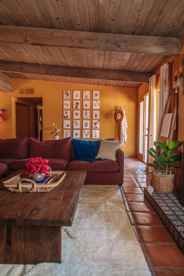
Welcome to our warm and moody living room in our Palm Springs home! With ochre walls, lots of deep wood tones and the coziest couch to ever exist, this room feels so inviting. This is the first room you enter when you walk into our home, and I wanted people to immediately feel welcome.
I think we accomplished that! First, let’s check out the before and after of how we made it happen!
Before & After
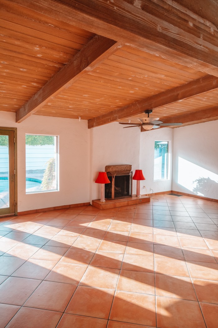
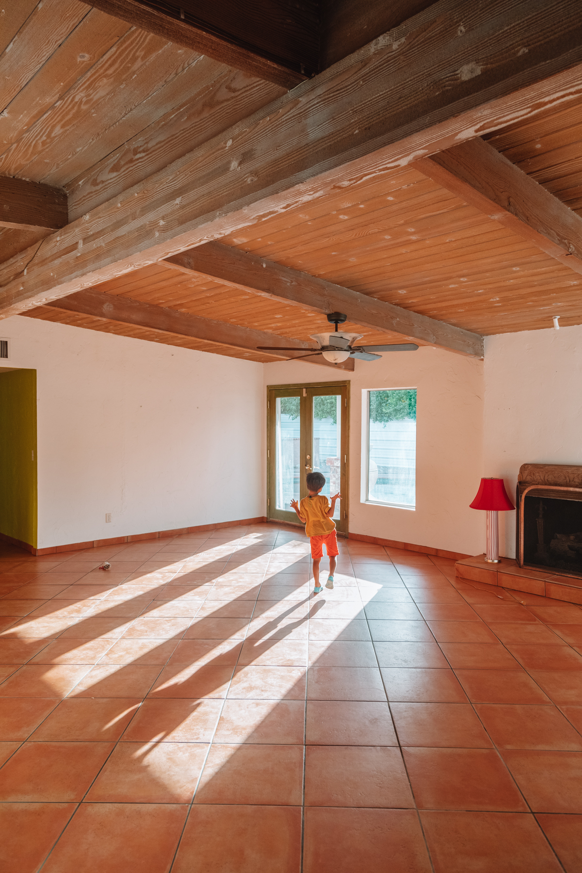
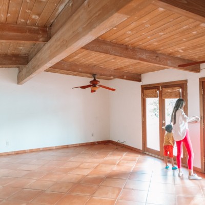
When we purchased the house, the walls were white in this room and the floors were a faux Saltillo-look tile. Here’s the transformation!

Choosing Ochre Living Room Walls
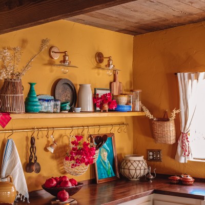
The entry way, living room and kitchen flow together in this home and I knew I wanted to try ochre walls for the space. It felt like the perfect bold color, yet neutral enough to allow other colors to pop against it.
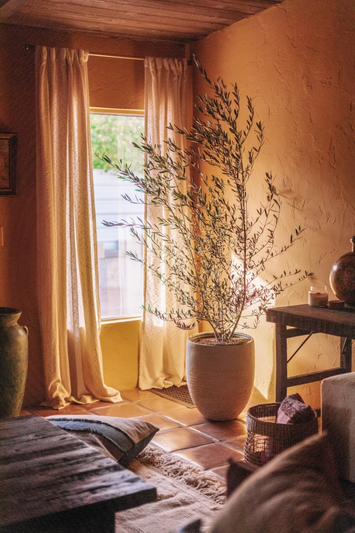
We chose ‘Wildflower Honey’ by Dunn Edwards and couldn’t be happier with our choice. Yellow is a color that looks so different in every light and at any point during the day, so it’s really important to test it on all walls and at all times of day and night. We did exactly that and loved how this tone looked in every corner.
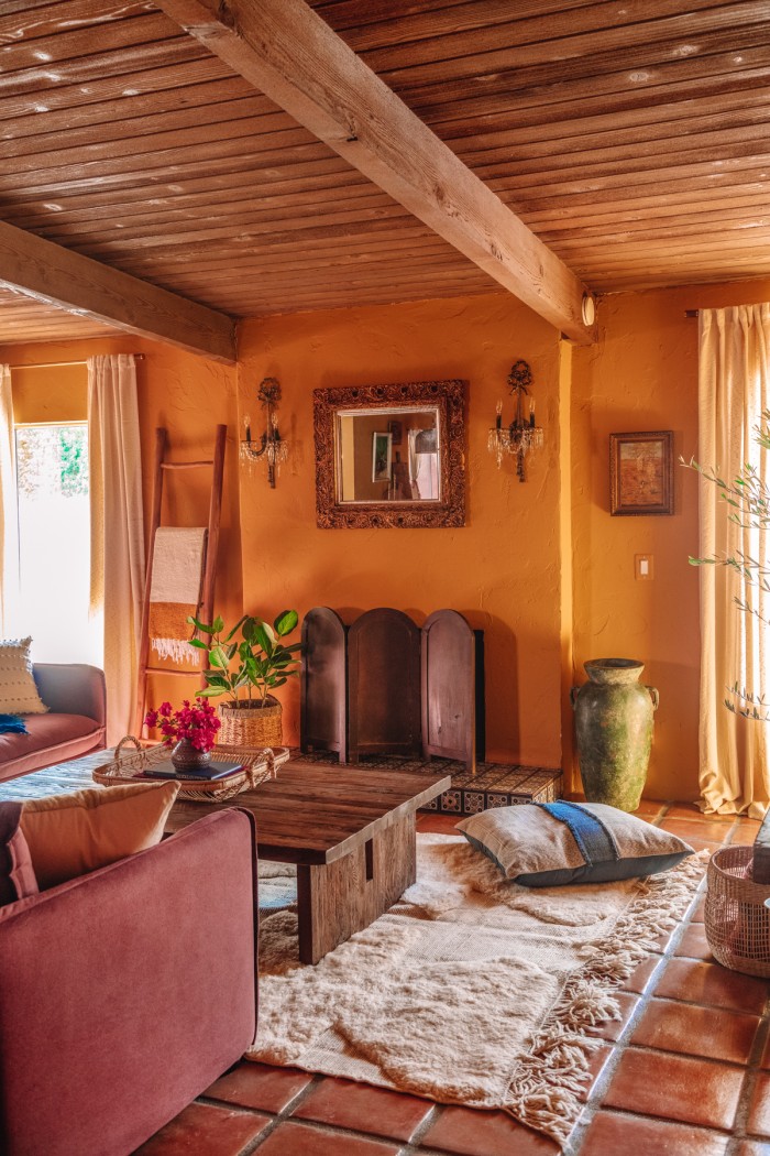
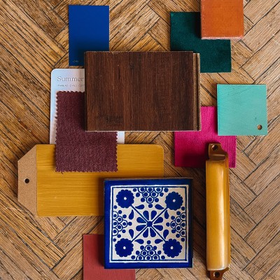
Ochre looks good paired with greens, plums, pinks, deep reds and cobalt blue tones. It’s also beautiful with deep wood tones, which we layered throughout the house in addition to the ceilings which we had custom stained to the perfect shade.
Ochre also makes a fantastic contrast with warm ivory tones, like the Soukie Modern Moroccan rug we layered into this room.
Botanical Gallery Wall
You enter the home into the living room and straight ahead are French doors to the backyard. I wanted to create an entry way with this space by adding a long bench and coat rack.
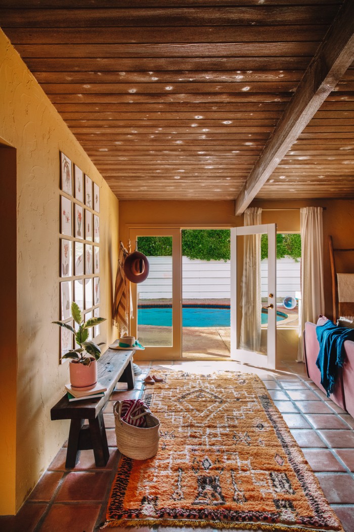
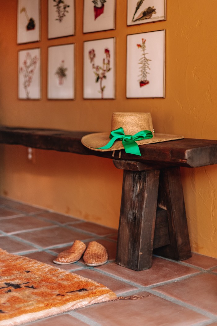
Above the bench, I created a gallery wall out of rock plant book illustrations from the 1940s. I framed each one in a thin brass frame and think it adds the perfect amount of height to this space!
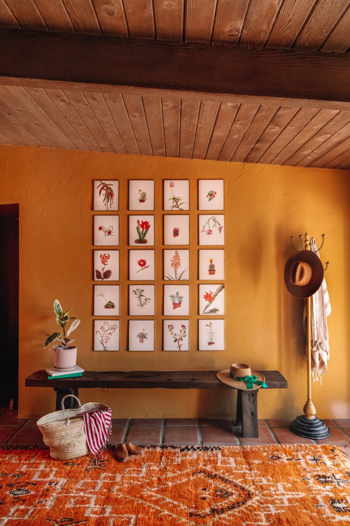
The bench was custom made in Mexico from Buena Vista Furniture and we added a vintage rug from June & Blue in front to add another shade of yellow into the space.
Our Plum Sixpenny Sectional
The living room is a large space and needed a large sectional to anchor it. I’ve longed wanted a Sixpenny sectional and knew it would be the perfect fit in here. I was so excited to get to partner with them on this space.
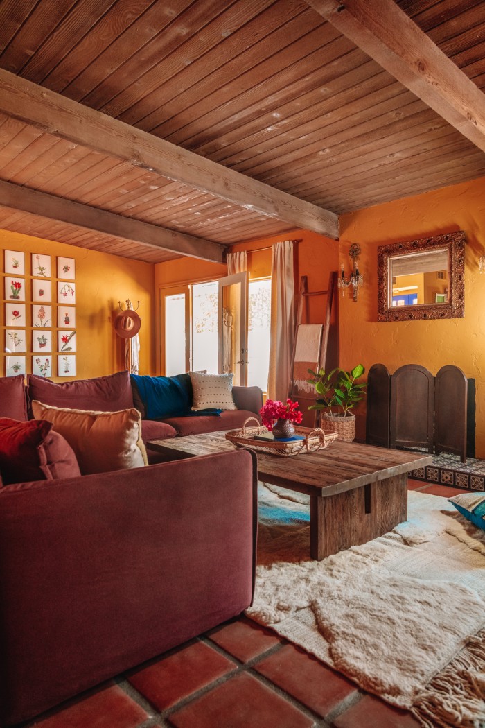
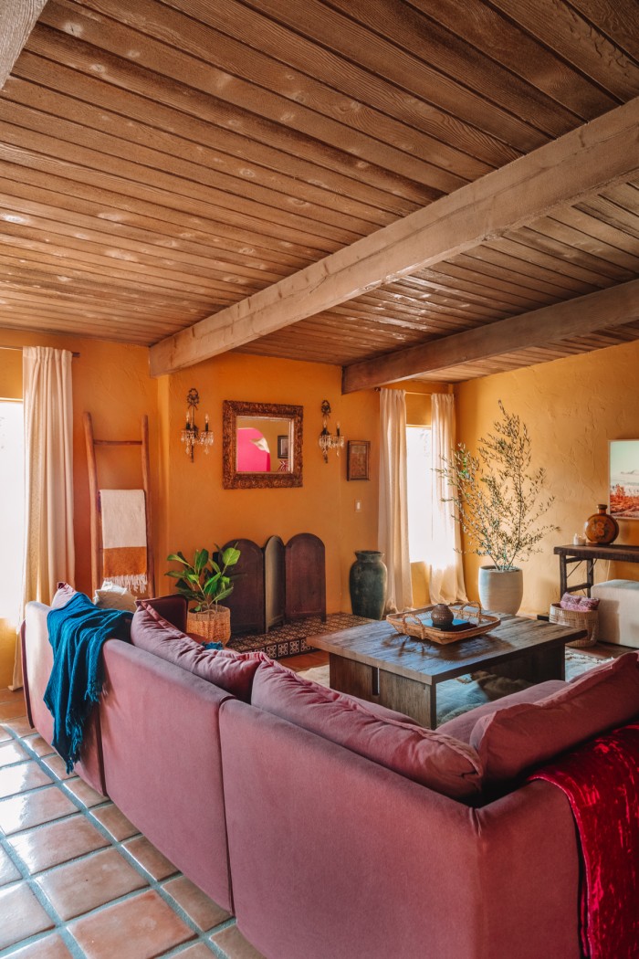
We went with the Neva Corner Sectional in their summer plum thread dyed cotton linen. The deep plum color is such a bold and stunning contrast to the ochre walls and a great addition to this moody living room space.
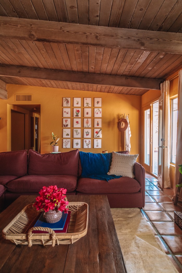
I don’t think there is a sofa more comfy and beautiful than a Sixpenny one. That’s not always an easy combination to find! Clean simple lines, but with French seams that add so much character and deep seats with the fluffiest feather down fill to make it so comfortable and perfectly lived in.
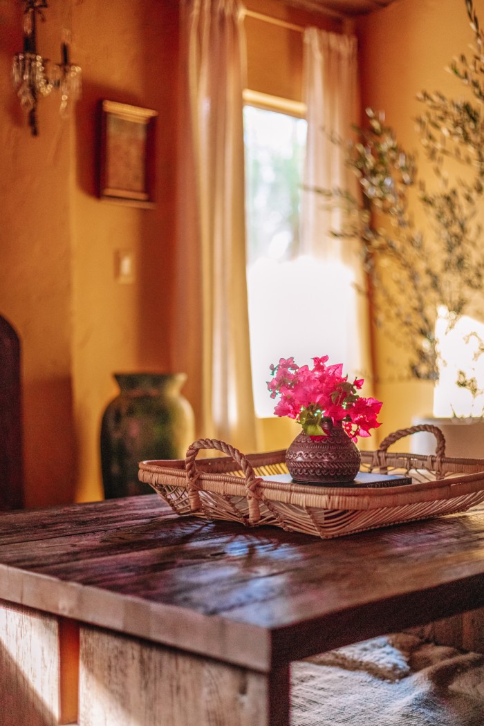
I could not recommend it more. We also added their reclaimed oak Kai Coffee Table. It plays so well off the age of the wood ceilings in this room and is the perfect size paired with the sofa.

Incorporating Antiques in the Living Room
So many of the remaining items in the space are vintage or antique finds. Incorporating antiques into any space gives the design so much history and charm.
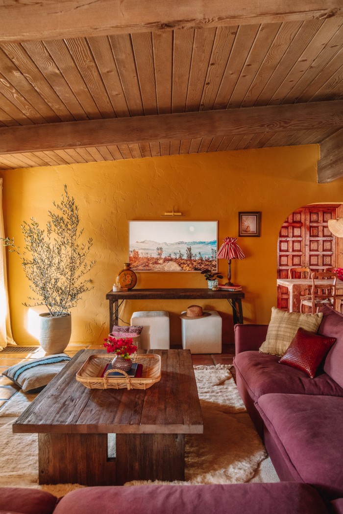
Our media console is an antique Indian wedding table, which we slid two ottomans underneath for extra seating options. Contrasted with a sleek Samsung Frame TV that looks like art and a brass battery operated picture light brings so much dimension to this large wall next to the large olive tree.
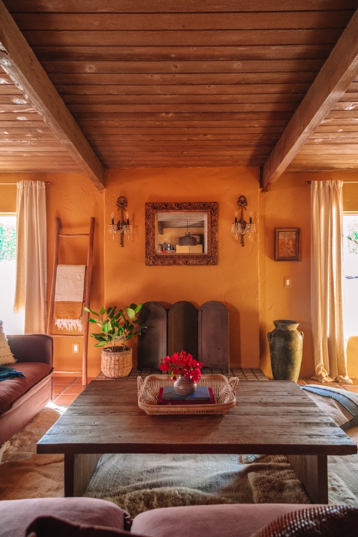
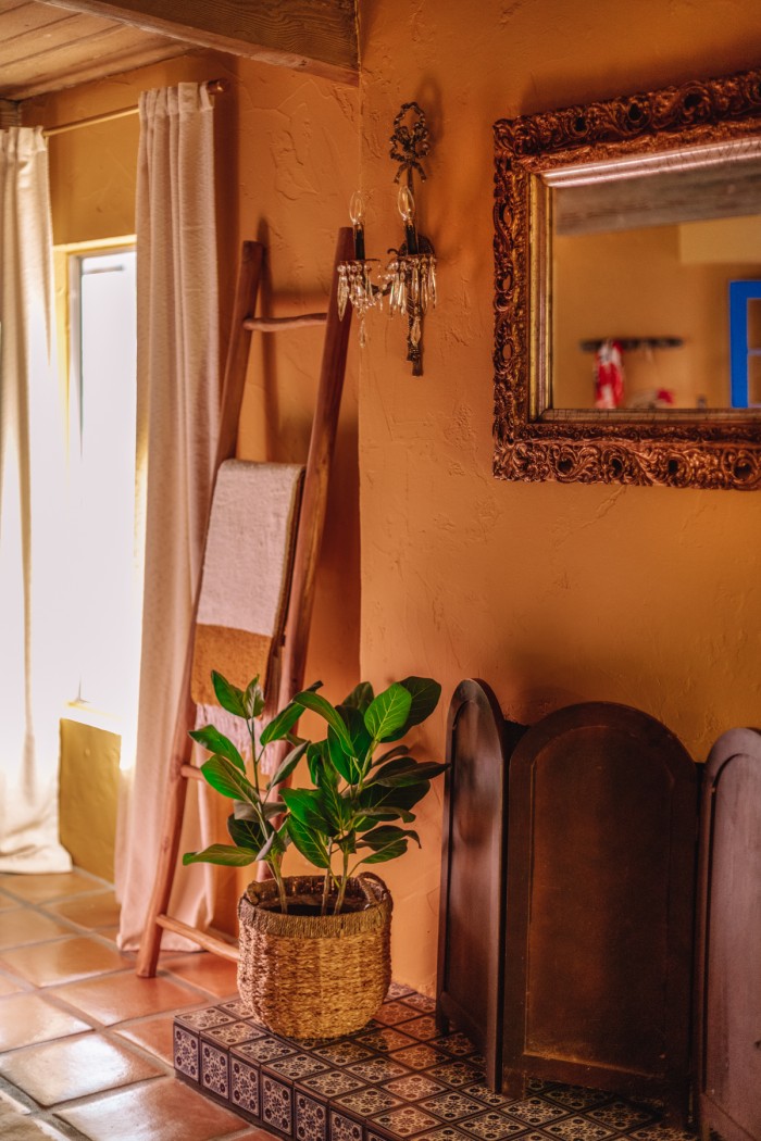
Above the fireplace we added an antique brass mirror and sconces, with a wood folding screen set in front of the fireplace, which is nonfunctioning but a great focal point.
Layering in Pops of Color to a Moody Living Room
I still wanted a few bright pops of color in this moody living room.
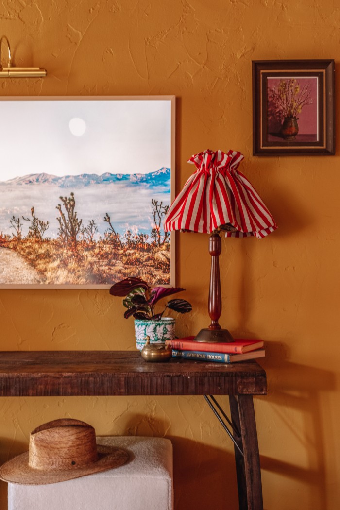
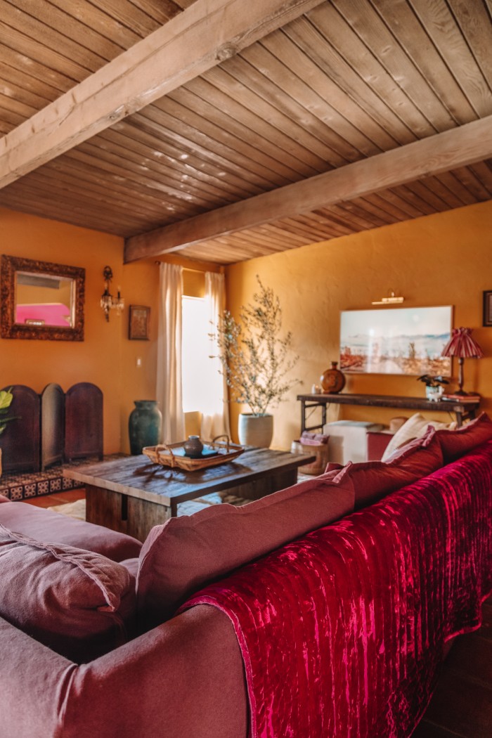
A vintage green pot next to the blue tiled fireplace (leftover from our kitchen, stay tuned for that reveal!), a DIY red striped lampshade and a raspberry hued velvet quilt added hints of color to draw your eye around the room.
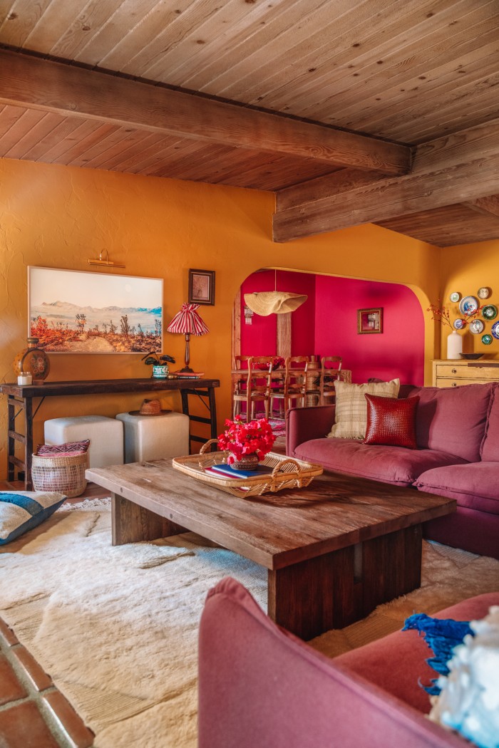
Of course, there’s also the berry pink dining room peeking in in the background, stay tuned for that reveal!
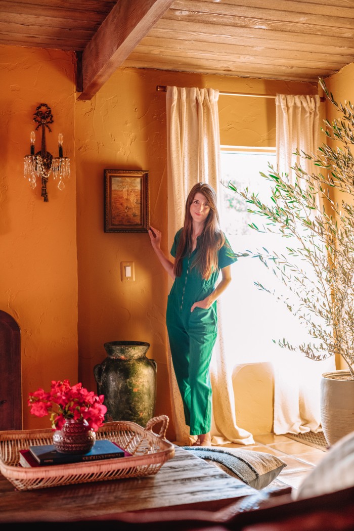
Living Room Sources
Paint: Wildflower Honey by Dunn Edwards*
Sofa: Sixpenny Neva Corner Sectional in Summer Plum Thread-Dyed Cotton Linen*
Coffee Table: Sixpenny Kai Coffee Table*
Ivory Moroccan Rug: Soukie Modern
Pink Velvet Quilt: Gru Home
Botanical Illustrations: Vintage from Long Beach Antique Market
Brass Frames: Target
Wood Bench: Buena Vista Furniture
Coat Rack: Vintage from Hide & Seek
Mustard Vintage Moroccan Rug: June & Blue
Blanket Ladder: Goodies
Mirror: Arte de Mexico
Sconces: Vintage from Rose Bowl Flea Market
Folding Wood Screen: Victoria’s Attic Antique Mall
Brass Curtain Rods: Target
Cream Curtains: Target
Olive Tree & Pot: Lowes
Indian Wedding Table: Vintage from Long Beach Antique Market
Boucle Ottomans: Target
TV: Samsung Frame TV, 55″ with Beige Bezel
Brass Picture Light: Amazon
All other decor not listed above: Vintage or Secondhand
My jumpsuit is by Noble.





Chelsea says
This space is a dream! I love it!
Alyjaa says
Its so beautiful
Brittany says
It’s so beautiful! I would love to relax here with friends – I see so many good times in the future for you and your guests!
AGL says
SO great! Can we see another angle of the plate wall? How did you hang them??
Kelly says
I will share more pics & details of it when I share the kitchen reveal!
Julie says
My #1 question is when will the rental go live?! LOVE!!!
Kelly says
Haha thank you so much Julie!!
Patricia galvan says
What a beautiful remodel! Looks so cozy & inviting. Somewhere you would never want to leave.
Sammy says
Are you still recommending the sofa? Does it stay as clean looking as pictures?
Kelly says
Yes! We love the sofa. We don’t live in the home full-time so I can’t speak specifically to daily use, but it still looks great and is so comfy! We have to occasionally fluff some of the cushions but that’s it!
Lauren says
Hi there! I went to the link for “Wildflower Honey” and I was shocked by how different the paint swatch on the website is from your photos! Can you confirm that they haven’t changed the paint color that’s linked? Thank you.
Kelly says
Hi Lauren! Yes, it’s the same color! Lighting makes such a huge difference in how a color looks in different rooms, locations, even times or day and lighting situations! Colors always look brighter when on all four walls, reflecting off each other, too! These photos are edited, of course, however the color looks warmer in our home than it does on the swatch on the website regardless. It’s always best to get a sample and test it in your own home to see how it’ll look! Hope that helps!!
Raquel says
Thank you so much for sharing your beautiful project. It would be great to know more about your flooring process. What kind of terracotta tiles did you use, sealant etc? Any pros-cons to share? I have been wanting to replace my living room carpet with terracotta and I love the deep red of your tiles. Some of the other Saltillo tiles I’ve seen are beautiful but have a bit too much color variation of red-yellow for my space.
Kelly says
The tiles we used are from Colores de Mexico in Los Angeles. They are the traditional Lincoln Red color. We had them professionally installed so I unfortunately cannot speak to the install process myself. I love how they look but they do show wear and age, which to me adds to the charm but to others may be bothersome. You could choose to add a more substantial, glossier sealer that would make them easier to clean (but also make them shinier, so that would alter the look)! I’d recommend testing (yourself or with a professional tile installer) a few sealant options to see what you like best if you decide to use them!