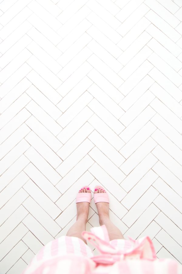
Remember that time we got a new studio?!?! Well, we’ve been officially moved in for about three months now and we’re finally ready to make some major moves on the design of the space! And of course, we’ll be documenting it all here!! But before we start sharing what we’ve already done and what our specific plans are for each space, I wanted to bring you guys up to date on our vision for the space overall!
Since I’m also in the middle of designing our house (and 4,000 new products… and blog posts…) we brought in our girl Cyn (you may remember her from her skills at our Palm Springs shoots like this and this!) to help bring our vision to life. I’m SO excited about what we’re putting together!! Here’s a little bit of inspo and updates to get you guys up to date!
First, our mood board for the space overall…
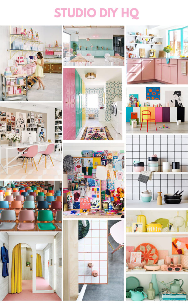
Sources (left to right, top to bottom): 1, 2, 3, 4, 5, 6, 7, 8, 9, 10, 11, 12
We’re creating NINE distinct spaces! I’m really excited to have these separations after working in an open loft for so long, and hoping it lends to a more organized work environment. Here’s what they are: The shoot space, the storage room, the bathroom, the kitchen, the lounge, the craft nook, the office space, my office and the entry closet. We’ll be talking about each one individually as we work on it to give you more of a deep dive into the plans!
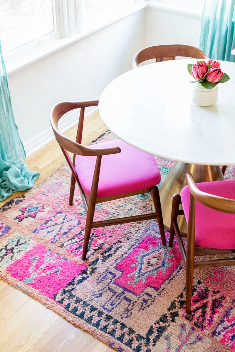
Similar to our house, we are going with a white base and a TON of pops of color. But we’ll go a little more bold on those pops here because WHY NOT?! Our house has a very distinct color palette I’m working within (not including Arlo’s room!), but with the studio I want to have a huge variety of pops of color. I’m really excited for this to feel like a “grown up” version of Studio DIY. I’m actually going to talk a bit more about that in a post later this week, if you’re wondering what that means!
We’ll be bringing in a lot of storage and functional pieces so I hope those of you creating home offices or craft spaces will get some good inspo out of this! We’re hoping to do a couple hacks to closet doors, shelves, and other items to customize them, but in an easy and attainable way.
So far, we’ve painted the entire space white. I’ve said it before and I’ll say it again: a coat of white paint does magical wonders for a space. The whole thing looked instantly brighter, and it wasn’t even painted a dark color before (mint). It feels so good now.
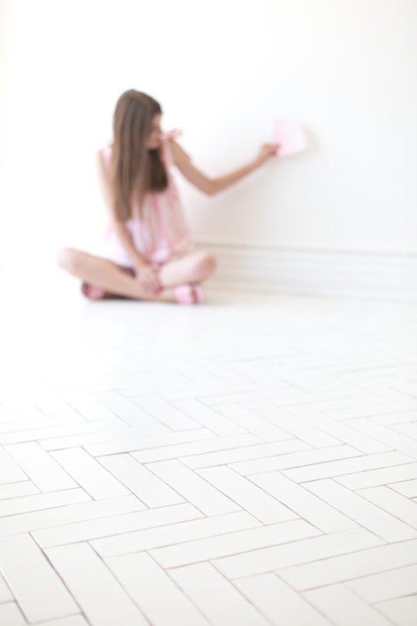
We also re-did the floors. In the front half of the studio, which is primarily the shoot space, we put in matte white tile (Here’s a similar one) in a herringbone pattern and I LOVE IT SO MUCH. We learned twice that painted concrete floors look beautiful…but they are so hard to maintain. So. Hard. We still wanted an all-white look, so this tile was the perfect solution. I could not be happier about it. It’s still bright but SO much easier to clean and it feels a little more “homey” and less harsh than concrete, too.
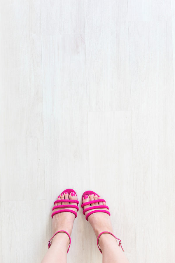
In the back half of the space, we also wanted a bright, white look but it didn’t need to be as intricate so we went with a white-washed oak vinyl (Here’s something similar). I’m SO happy with how it turned out. I found a lot of white-washed vinyl ended up looking gray, which I’m not a big fan of, but this one feels a little warmer. It’s PERFECT! And it was a great option for our space because it has a click lock assembly system so it was easily installed right on top of the existing tile floor.
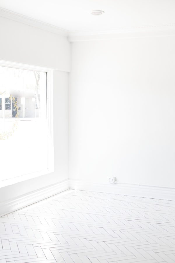
Photos by Jeff Mindell
Next up, we’ll be finishing the shoot space and building out the kitchen, so expect some more in depth updates on those soon! If there’s anything you’re particularly interested in when it comes to office spaces, craft storage or photo studios… let me know below!!!
SaveSave





Amanda says
Yessssssss I have been waiting for this!! Bring us all the colorful storage and organizational tips please!!
Paige says
I cannot wait for this series and to see all of the progress! I can totally see your “grown up” vision in the moodboard. It’s a bit more boho like your home, and BEAUTIFUL!
I would love to see some craft/supply storage ideas. I love clear bins for my storage so that I can see what I have, but it tends to look messy. If you have any ideas for that that would be awesome!
Thank you for sharing!
x, Paige
Kristina B says
YESSSSS Can’t wait to see how it all comes together! Office design is my FAAAAAAVE.
Michelle says
Definitely love the color scheme, and those floors are gorgeous!
https://www.makeandmess.com/
Spooky says
Where is the dress in the top left corner of the moldboard from?
AP SBTET Results says
good