Last week I shared the design inspo and plan for our new kids bathroom but today I wanted to share the layout changes we are making and an official progress report!!!!
As you may remember from my last post, I reached out to Build.com this past summer to partner with me on this renovation because in my searches for the main pieces of the room, like the vanity, faucets and oval shower curtain rod, I kept landing back on their site!
They have a HUGE range of home improvement products across a ton of different styles and at really competitive prices. They also have really dependable stock and a lot of in-stock items so you are able to get moving on your projects quickly. It’s been such an incredible experience from start to (almost) finish for us.
I’ll walk you through what we chose and why below, but I also put together this page where you can shop the look all in one place!
On Keeping the (General) Layout
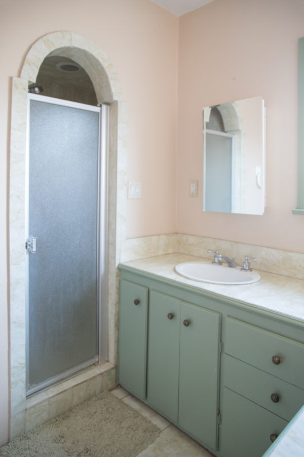
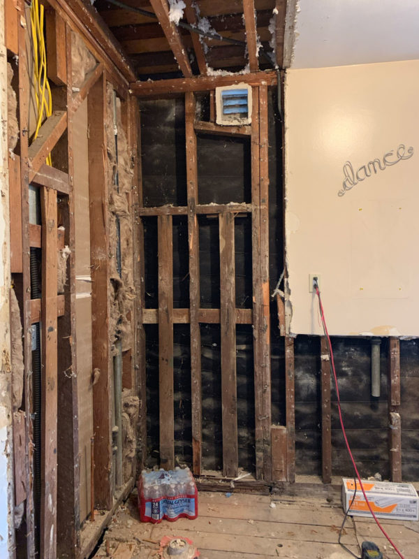
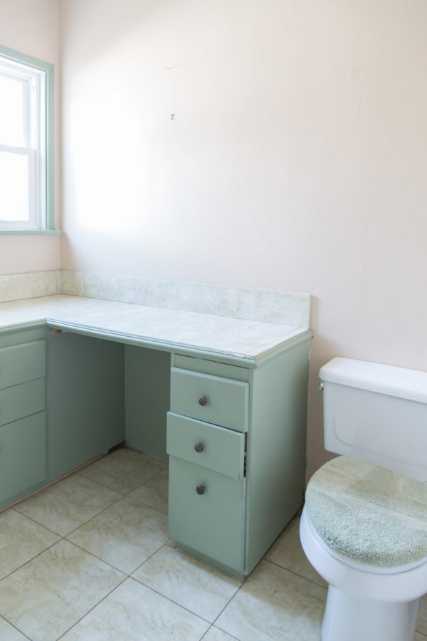
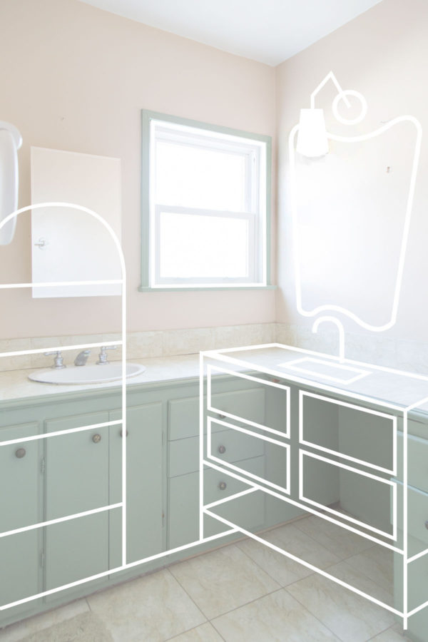
Like with our master bath, we tried to keep the layout as close to the same as possible to save money. This wasn’t quite as easy since we needed to add a tub and therefore slightly move the shower plumbing and the sink. But we were able to keep the shower plumbing in the same general area and the toilet in the exact same place which was huge!
Flipping of the sink from the back wall to the side wall was really the only major change!
Not pictured is the built-in linen closet that was on the other side of the shower, that we had to sacrifice to add a tub. That’s why we are adding in a rattan shelf for additional storage where the sink used to be!
On Adding A Bath Tub
Since we decided to remove the tub from our master, we knew we needed to find a way to add one here.
We quickly realized it would be hard to fit both a tub and a separate standing shower in this space since it is essentially just one big square. I didn’t really want to do a built-in tub/shower combo because we would have had to build another wall to make work.
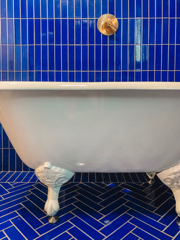
BUT, I’ve wanted a claw foot tub since… forever? And after seeing a few really stunning claw foot tub/shower combos, I decided that was the perfect solution!!!
I went with this one from Signature Hardware and will be adding a rain head and oval shower curtain rod above it to make it shower-capable. I love that it gives this instant old-world feel to the bathroom!
On Mixing Blues
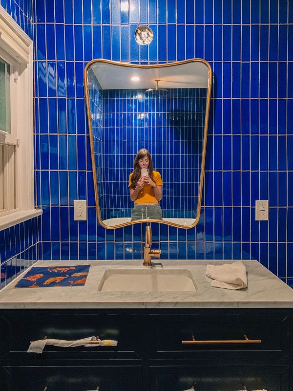
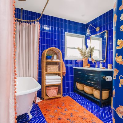
I really wanted to play with tones in this bathroom, mixing different shades of blues and orange/terra-cotta to give it a lot of depth.
The tile we chose is a really bold blue so I picked a navy vanity to contrast it!!!! Originally I thought perhaps I’d have to paint one myself since my other priorities were drawer space and a spot underneath for baskets. But then I found a Signature Hardware vanity on Build that checked those boxes and WAS ALREADY NAVY!!! It’s a really pretty midnight shade and I love how the two tones play together.
Keeping Finishes Consistent
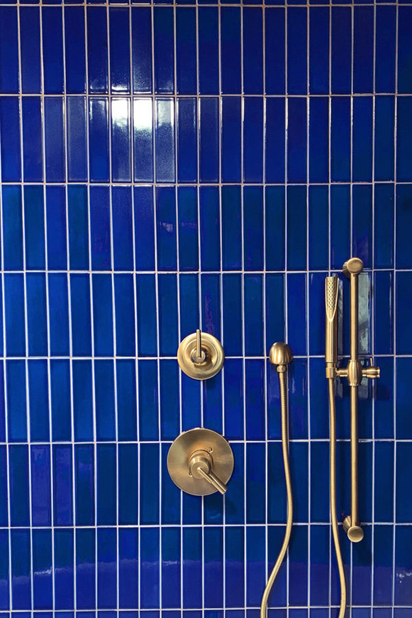
One thing we somewhat unintentionally did was keep all the faucets, hardware and finishes in the house the same which makes the home feel really cohesive as you flow through it.
We initially picked out Delta fixtures in Champagne Bronze on a whim for our master bathroom because we liked the finish and they seemed to fit best with what we needed for that room. We ended up loving the functionality of them so much that we went with Delta for our kitchen, too. And now we turned to their products again for this room (all of which are available on Build.com!)!
In addition to the rain head and tub spout, we decided to add a hand shower to make bathing kiddos easier!
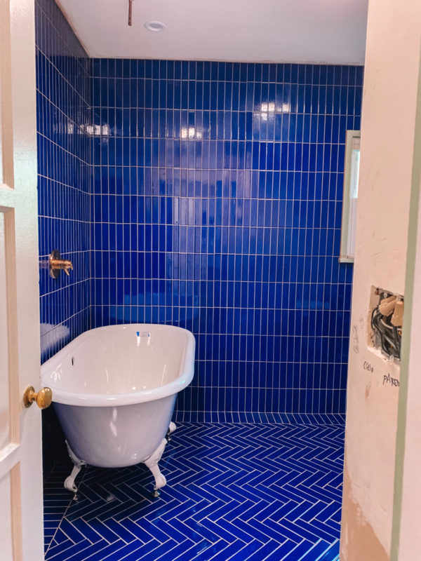
As we speak, the curtain rod is being hung, sconce is being installed and the tub is being hooked up to the plumbing! Then I just have to come in and finish it off with baskets, hooks and decor and we’ll be ready to share the final thing!!!!!!
In the meantime, you can shop the products we used right here and check out the design inspo and other design elements of the room right here in my previous post! You can also reach out to Build.com’s project experts if you need (free!) advice on your specific project too!!
Stay tuned!!!
I was provided product from Build.com in exchange for partnering on this post and project. All opinions are that of my own.






at home with Ashley says
Keeping the plumbing in the same spot sounds like a big win! I love that you’re keeping the hardware the same as the rest of your house, but then having all the fun with colors. I’m sure it’s going to look so fab.
Carmen Navarro Designs says
Oh, this is so good. Love the tub & the rain shower head. Feels so vintage with a modern day twist. & the coordinating gold details through out the house is “gold” 🤣. Can’t wait to see the final reveal it will be amazing.
Mia G says
I am so stinking excited to see how this comes together!! It already looks SO GOOD
writers says
Other bathroom habits are as important as teaching kids to wash their hands in the first place. And the learning process can be tough for some parents. Such bathroom ideas are just great for any parent who wants to make it easier for a kid.
Saffron says
Love it so much. I really hope you don’t mind but when I grow up and get my own place, it’s going to look exactly like this 😂I love eveything about your style, it is also very me. Great job on all the hard work, my family and I renovated an old house too and a lot (and I mean a lot) of time and effort and blood, sweat and tears go into it all 😆.
Good luck in all the rest! 😁😁