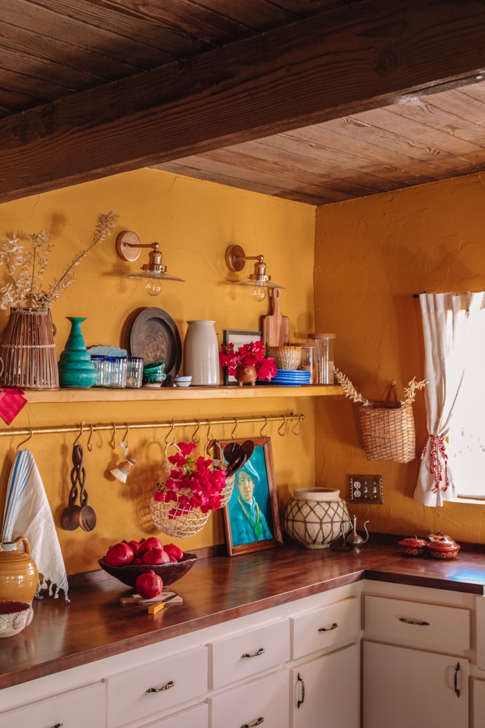
Welcome to our Palm Springs kitchen! Our warm, inviting, moody yellow kitchen. I am very proud of how this space came together, especially when you see the stark difference from where it started.
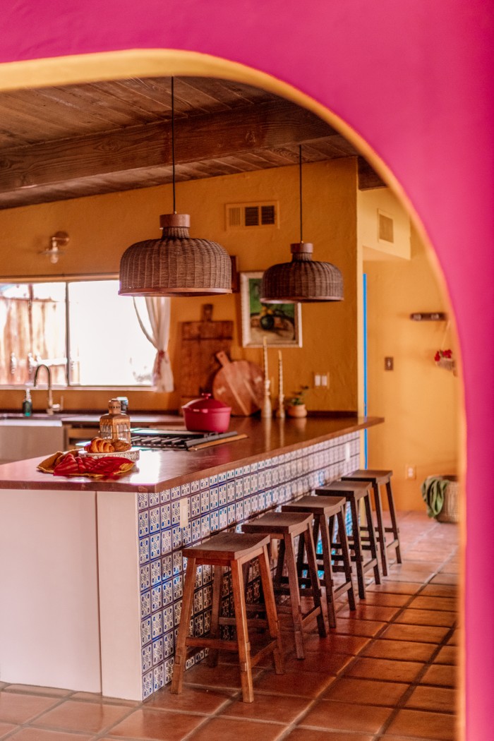
The renovation of this kitchen was the most important of the entire house, it opened up the home and made it feel like a true vacation home where you’d want to relax, entertain and spend time with family and friends.
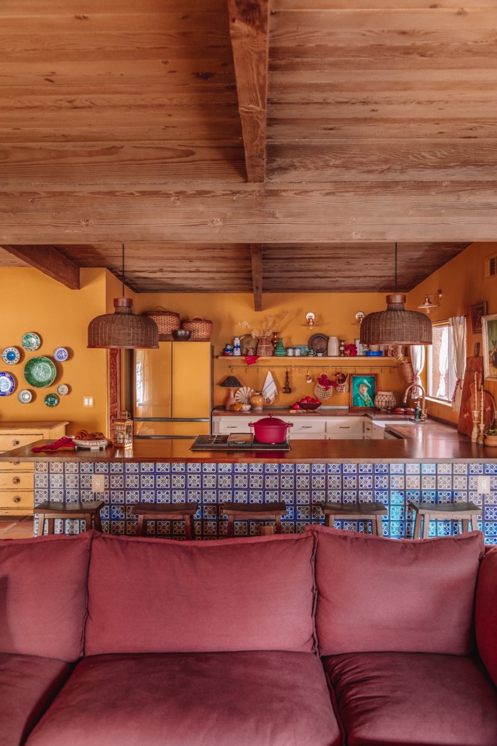
In addition to that, I was focused on breathing history and character into this space that felt more in line with the character in the rest of the home and I think we made that happen. Everyone that has walked in says “Wow this feels so… old” in the best way and, to me, that is the best compliment I could possibly receive!
Table of contents
Creating an Open Layout
Let’s start with a few before and afters. When we purchased this house, the kitchen was walled off from the living room. While this allowed for plenty of additional storage, it also divided the room very starkly.
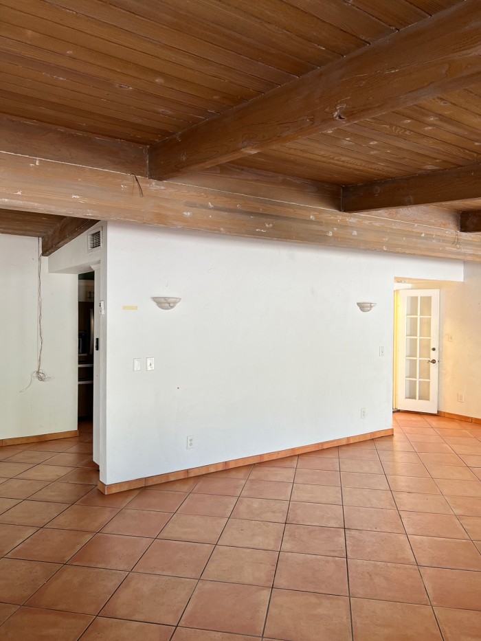
There are certainly benefits to having a separate kitchen, but in a vacation home, I felt that we’d want to be able to be in the kitchen while also enjoying the company of any guests and seeing a view straight into the backyard. So, the first thing we did was remove that wall.
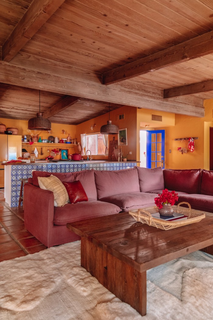
We are thrilled with not only how open this made the space, but how it gave us the opportunity to add a peninsula for a casual dining and entertaining option.
In the below image, you can see we removed the upper cabinets to create a lighter, more open feel to the kitchen itself, too.
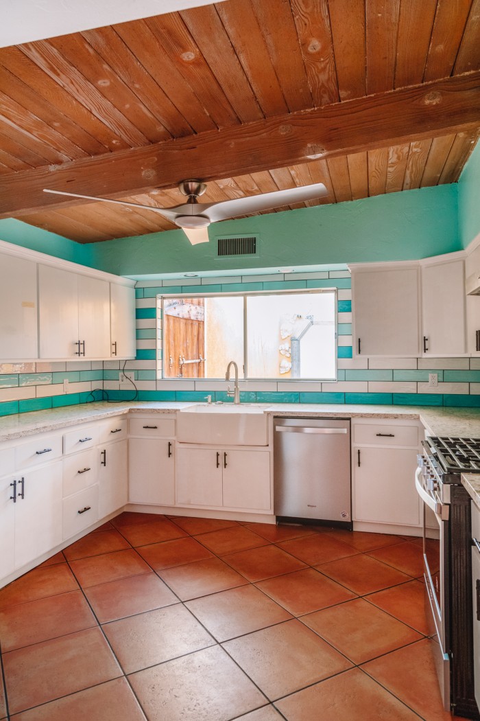
Because this is not a main residence, the lower cabinets provided plenty of storage. The upper cabinets felt heavy and unnecessary.
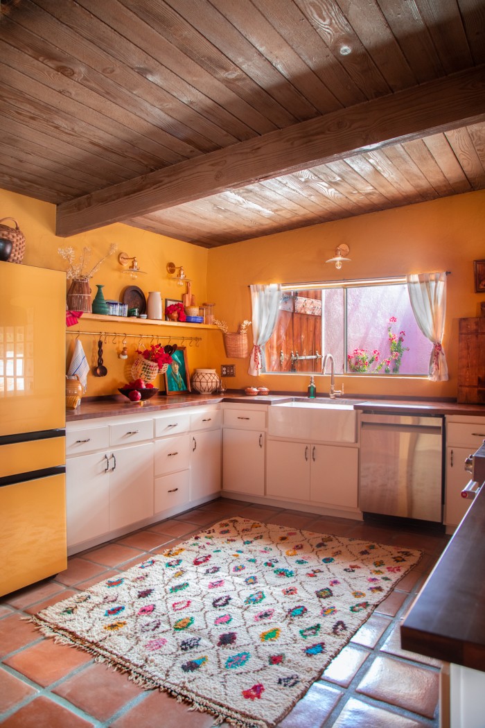
Now, with open shelving and a pot bar, we have the opportunity to add more character to the kitchen and store functional items that we use every day when there.
The Perfect Yellow Kitchen Tone
I have long wanted a yellow kitchen and even tried once and failed on the way to our blush kitchen. This time, we picked the perfect yellow.
The shade is Wildflower Honey from Dunn Edwards. It’s warm, without being Mac-and-cheese toned, but not oversaturated. It has just enough depth to it to read moody instead of pastel.
Wicker Baskets | Brass Pot Rail
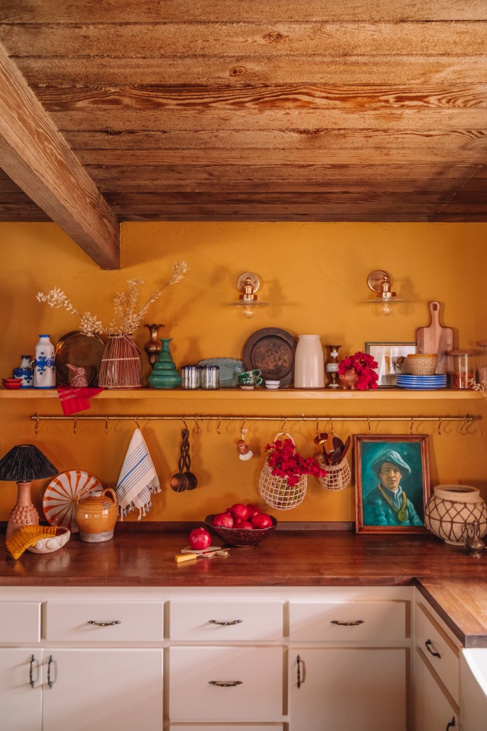
Glass & Brass Sconces | Brass Pot Rail
Yellow is one of the hardest colors to get right. It changes so much in different light and throughout the day. I used my paint color selection tips extensively on this room and the living room, testing the color options on each and every wall and looking at them at every time of day.
We kept the existing lower cabinets and gave them a fresh, durable coat of a deep cream tone called Finest Silk, also from Dunn Edwards. Plus, new (old) hardware I found second-hand.
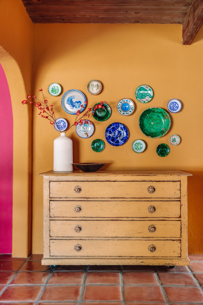
You have to find a color you’re comfortable with in all the shades it pivots to depending on the light. This Wildflower Honey color was it for me.
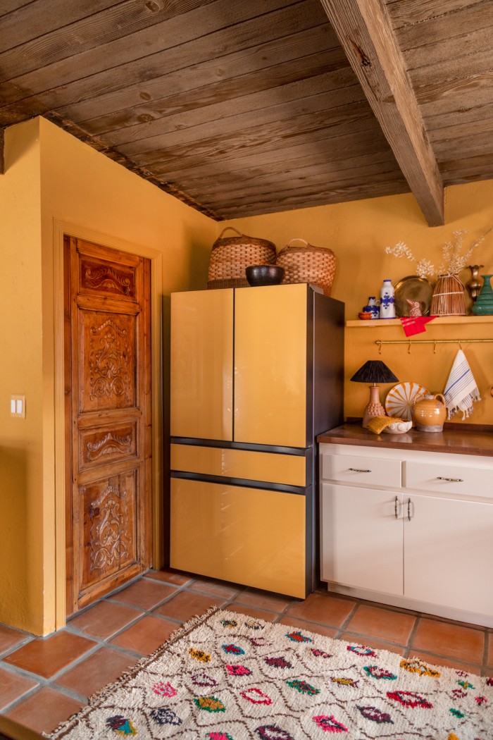
It also became the perfect backdrop for bolder pops of color in the decor and a seamless monochromatic backdrop for our Sunrise Yellow Samsung Bespoke 4-Door French Door Refrigerator from our partners at Samsung, which we love. There’s a hidden beverage center behind one of the doors!
Open Storage & Brass Pot Rails in Kitchens
We added open storage to our previous kitchen and have been really happy with it. We store items that we reach for every day, as well as items we don’t use often but love and want to get to enjoy, visually, more often, too.
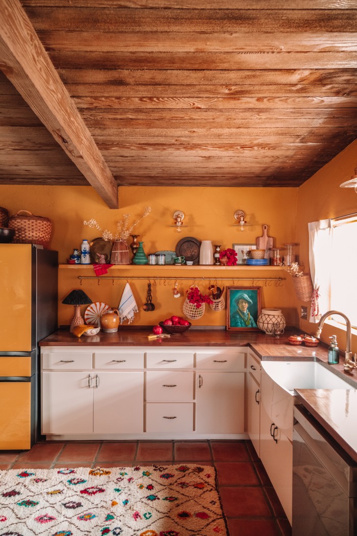
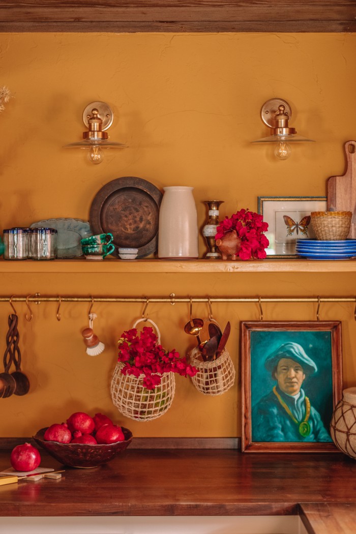
For this space, we went with one long shelf that spanned the back wall. We didn’t have the budget for a custom floating shelf, so I used a simple 2″ x 8′ wood plank from Home Depot, painted to match the wall and installed it with these brass brackets which I hid behind decor on the shelf.
Underneath the shelf, we added a brass pot rail from deVOL Kitchens. It adds so much age and character and has become a great spot for holding cooking utensils and dish towels.
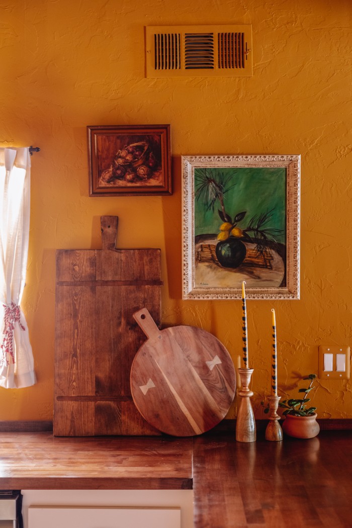
There were two more uncommon kitchen items I wanted to add to this space: adding art and a table lamp. The goal of this house was for it to feel cozy, inviting and like it had been there for ages and these vintage items make it feel that way.
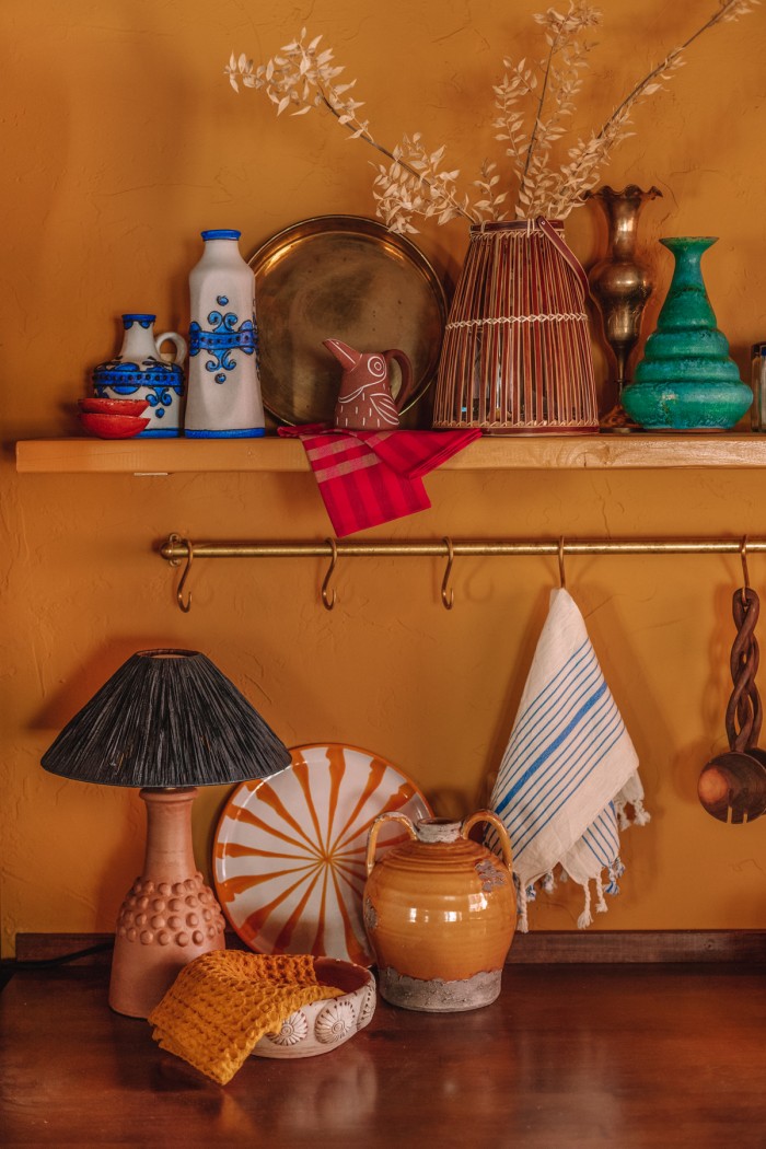
Brass Pot Rail | Striped Platter
Adding art to a shelf in a kitchen adds life and personality to an otherwise utilitarian space. And we’ve found in the evenings that we’ll turn on that lamp instead of the sconces we installed above the shelf for a cozy and dim source of light.
Adding a Kitchen Peninsula
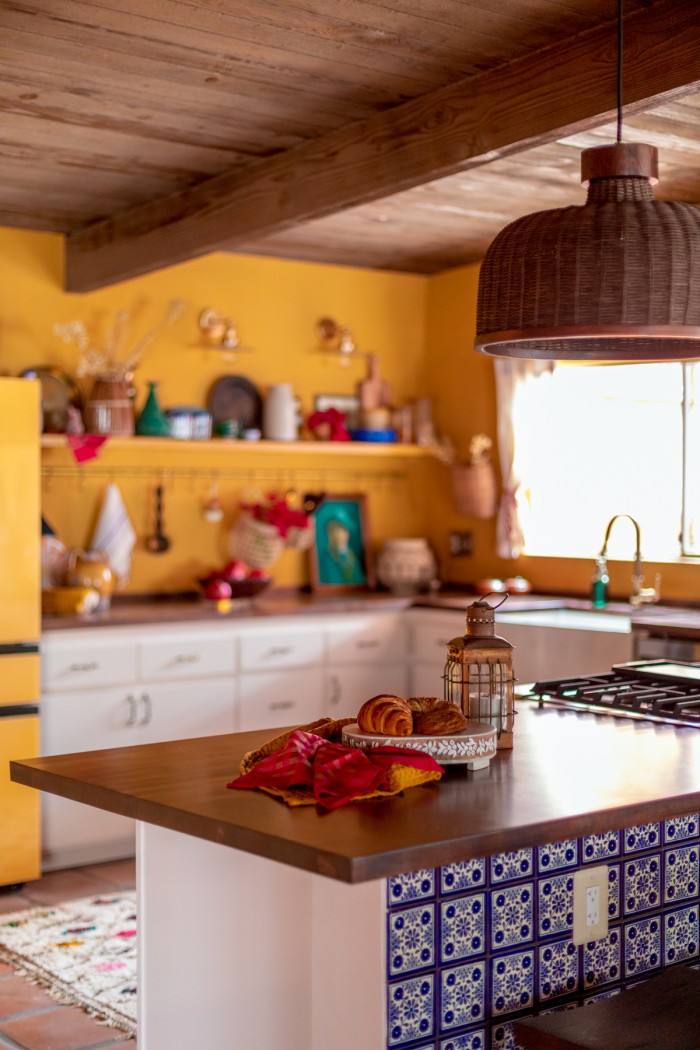
Eliminating the dividing wall between the kitchen and living room made room for a long peninsula. This completely transformed how we were able to use the space and is the best renovation decision we made.
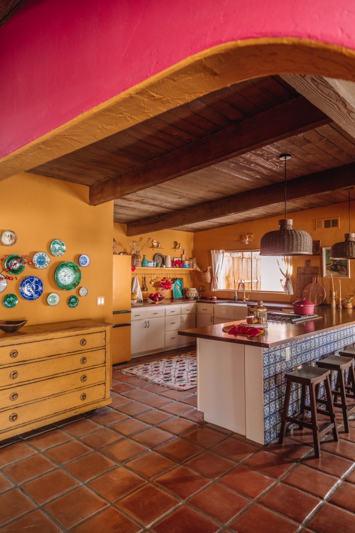
The long peninsula seats five and allows for open conversation between this cooking, dining and relaxing on the couch.
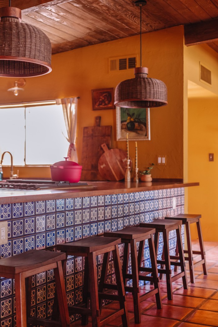
Wood Stools | Blue Tile | Wicker Pendant Lights
We chose to add a blue Mexican tile to the peninsula that adds a bold pop of pattern behind the simple wood stools.
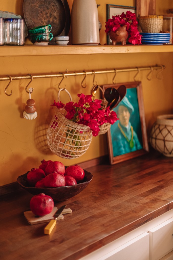
For our countertops, we wanted something that felt warm so stone didn’t feel right. We decided to use butcher block and stain it a custom color for a walnut look on a budget. It was sealed with Waterlox for protection. They turned out beautifully.
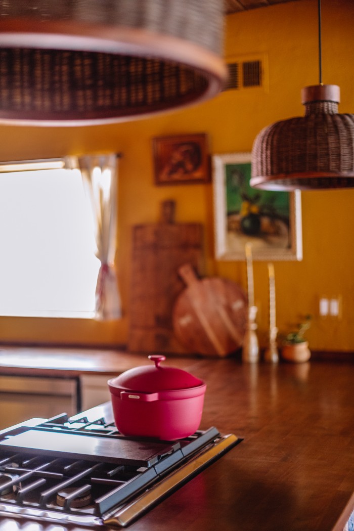
Above the peninsula we added two dark wicker pendants that seamlessly draw your eye up to the dramatic wood ceilings.
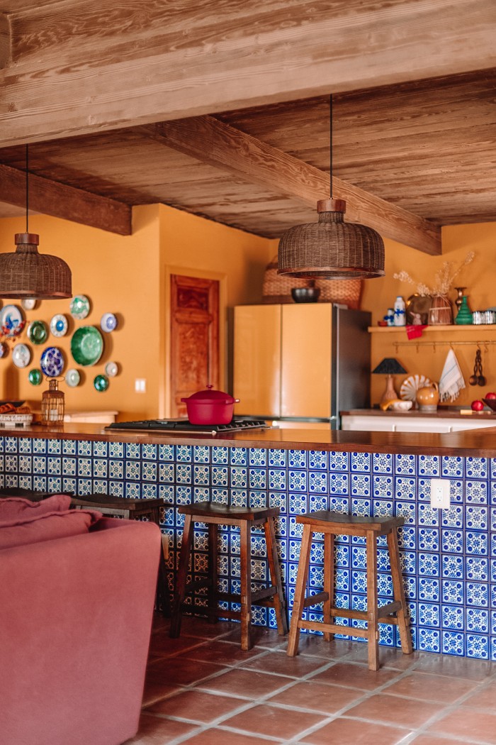
How To Make A Decorative Plate Wall
A decorative plate wall is an ideal kitchen statement wall to create. You can easily add to them as they feel fluid and can be ever changing. It allows you to display a collection of beautiful dishes that you might not want to use, but fit well in a kitchen environment.
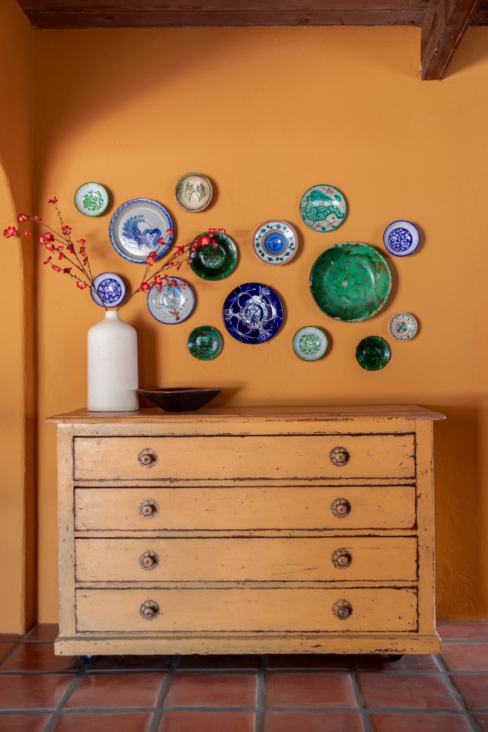
I hung my bowls and decorative plates using a few different plate hangers.
For most of the bowls and plates, I used brass plate hangers from Lowes that can fit plates sized 5 1/2″ to 14″. See below for more tips on how to measure your bowls.
The sizing on the hangers is based on the diameter of a flat plate. If you are using a bowl, you should lay the bowl rim side down and measure across the entire back of the bowl, from rim to rim. That measurement will correspond to the size plate hanger you need.
You simply stretch them around the back and hook the plastic covered ends on the rim of your plate or bowl. Then hang on the hook that comes with the set.
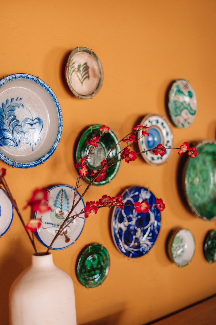
For my largest and heaviest bowl, I used a Display Buddie. They hold up to 24″ wide plates, and up to 10 lbs. This one has a drawstring that tightens the metal bracket around your bowl.
It comes with detailed instructions to follow, and worked great. They are a lot more pricey, but were the only thing I could find for bowls larger than 14″.
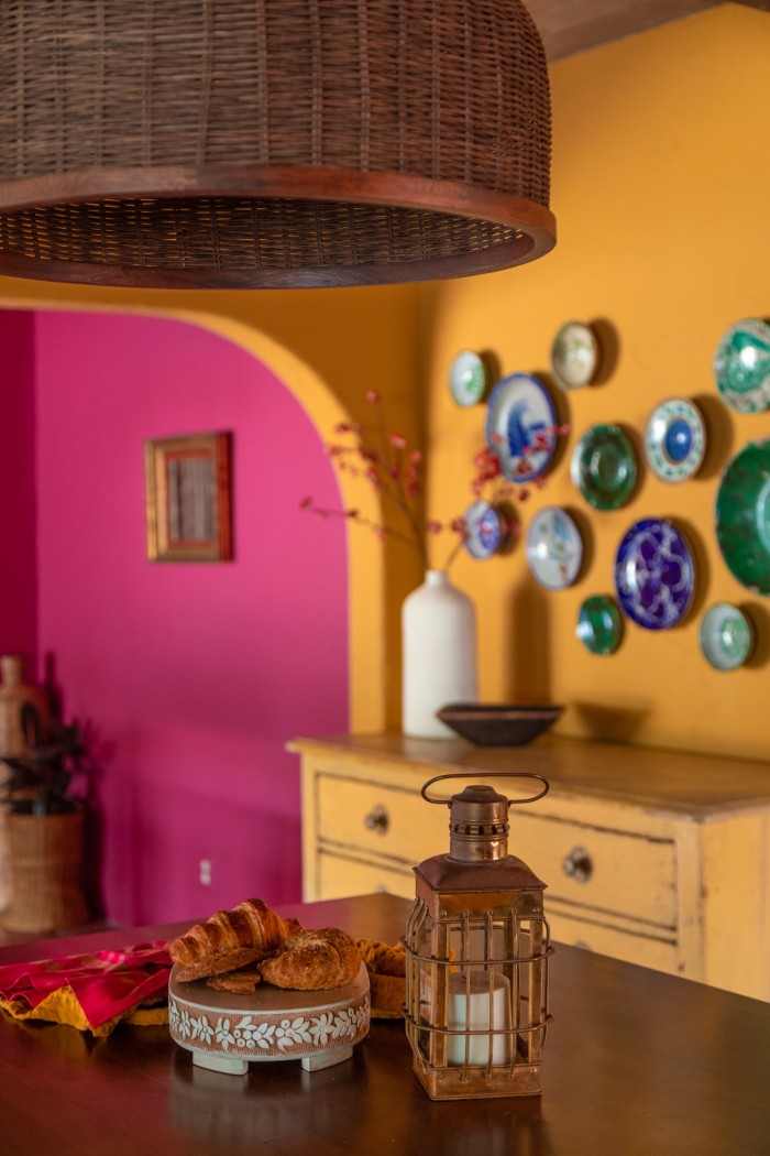
I found this incredible 18th century Scandinavian yellow chest at an architectural salvage store and it anchors the decorative plate wall beautifully. A piece like this, in between a kitchen and dining room, is great storage for linens and specialty dishes.
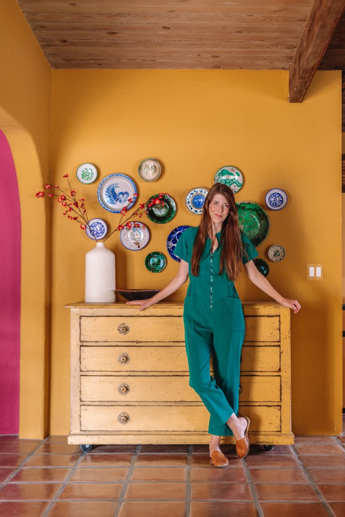
This kitchen feels, to me, like it’s been here forever and that’s exactly how I hoped it would feel.
Photos by Jeff Mindell
Kitchen Source List
Paint Color: Wildflower Honey by Dunn Edwards*
Cabinet Color: Finest Silk by Dunn Edwards*
Blue & White Tile: Colores de Mexico
Saltillo Tile: Colores de Mexico
Moroccan Rug: MoRugCo
Refrigerator: Samsung Bespoke 4-Door French Door Refrigerator in Sunrise Yellow*
Sconces: Elk Home
Brass Pot Rail: deVOL Kitchens
Wicker Pendants: CB2
Wood Stools: Target
Most decor not listed above or throughout the post is vintage, second-hand or antique.
My jumpsuit is from Noble.*
Studio DIY contains affiliate links. This means that we may receive a small commission on sales of products that are purchased through links on this site, at no additional cost to you. Product gifted to Studio DIY is indicated with an (*).





Marium says
THIS SPACE IS SO BEAUTIFUL! Every little detail about it is just so so perfect! Can’t get over it
Kelly says
Thank you so much, Marium!!
Elle says
I’ve been waiting for this and it was worth the wait! Gorgeous Kelly! It’s so welcoming and warm and fits so nicely with the architecture of the home
Kelly says
Thank you, Elle!!
DriverB says
GORGEOUS! And it really does feel authentic to the house.
Kelly says
Thank you so much, that makes me so happy to hear you say!
Debbie says
Love seeing this reveal and it is so so good! What a transformation. The wall/base color is just so inviting and warm, and I admire how you used other colors + the wood to create a beautiful and functional harmony.
Kelly says
Thank you, Debbie!! Such a compliment.
Carrie says
I’m so happy you finally got your yellow kitchen! 😂😍 it’s all so gorgeous!
Kelly says
Thank you Carrie!! I’m so happy it finally worked!! Only took me three tries, haha!
Ashley Moseley says
Wow, that is an INCREDIBLE SPACE!! As someone else said, every detail is thoughtful and perfect! What a great vacation spot!!
Amy says
Opening it up was the perfect choice! It looks gorgeous! We’re thinking about doing something similar in our home and the stove is along that space just like yours. I’ve wondered if we need to do anything to replace our vent for the stove since it won’t have a hood above anymore. What did you do for yours? Love the countertops too!
Kelly says
Hi Amy! We installed a downdraft oven, so the vent in the oven actually pulls in fumes, etc and it runs underneath our floors instead of up and out. It was pricier to install but we felt worth it in order to allow us to open up the room and not have a hood dividing the sightline! We’ve been happy with it so far!
Amber Phillips says
This is absolutely stunning!!!!
Also, I SO love that you kept the lower cabinets!
Amy says
Nailed it. It is perfect.
Azure says
It is so absolutely gorgeous, you really did just an amazing job!
Julie says
I seriously cannot wait for you to open up the rental. It is so beautiful.
Michael Rasmussen, R.A. (ret.) says
Orange, pink, off white cabinet fronts, Spanish red floor tile, dark brown wood ceiling/cabinet tops, with touches of green, blue, et. al., and those 1950’s era curtains! This is an Excedrin headache of hideousness.
This “decorator” could learn to limit her pallet of materials and colors.
Hannah says
Perfect work! I’m so glad you finally got your yellow kitchen. This kitchen reminds me so much of the beautiful, lively photographs of Mexico in Rick Martinez’ cookbook Mi Cocina.
Esther says
LOVE how this all turned out! Any more details you can share on the countertops? Curious on durability, cost, exact materials, etc.. THANK YOU!!
Cat says
such a beautiful, beautiful space!! Curious how you painted the air vent- did you find a matching spray paint or somehow use the wall paint?