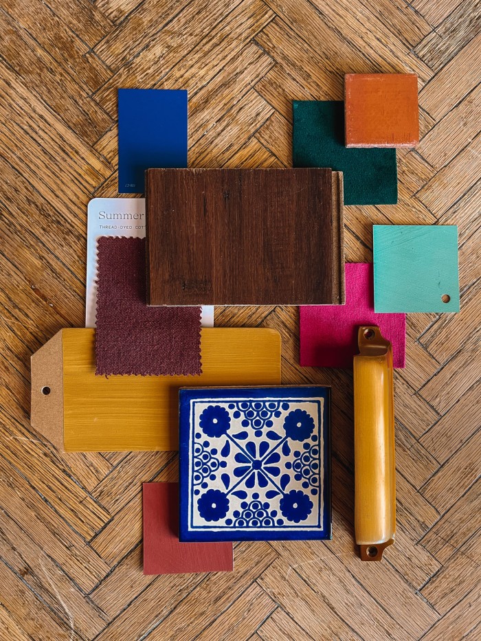
Let’s talk about the Palm Springs living spaces! To me, the whole point of a vacation home is having one cozy hub for family, friends, guests to gather round and enjoy eachother’s company. And that’s exactly what we’re making this space.
I’ll talk soon in the kitchen post about how we made this area more open, but for now, I’m going to share our plans for the living room. This room is large, central to the house, opens to the pool and to the dining areas. We wanted it to feel inviting, moody, lived-in. Not cold, like a quickly furnished place nobody actually lives, but like someone has been making it their home forever.
Here’s what we have planned!
The Color Palette
Below you can see the “before” of what we started with. Kind of a blank slate in this room.
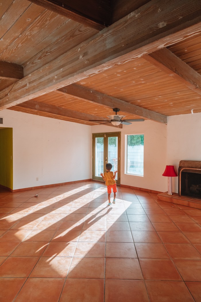
I wanted another attempt at a deep, ochre room after my kitchen fail. So the living and kitchen area in this house is it! And I think I succeeded this time after much debate about the perfect paint color!
We went with Dunn Edwards’ Wildflower Honey and I’m so happy with how it turned out.
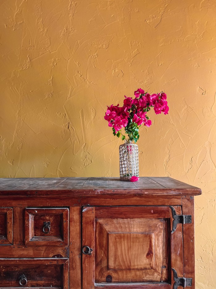
For the rest of the room, we’re incorporating colors you see throughout the house. A plum couch, like the purple in the guest bathroom, deep greens like our main bed and bathroom, pinks like the guest bedroom and lots of blue, too!
We’ll be incorporating lots of wood tones as well, with the ceiling and some beautiful wood furniture.
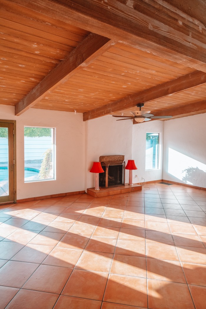
Here’s one last before shot above before we dive into the layout plan & progress!
The Layout
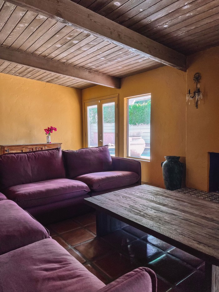
To me, the most important piece of furniture in a home is a big comfortable couch. And we are DELIVERING on this! We got to work with Six Penny and have one of their linen Neva Corner sectionals and it is an absolute dream. It is huge and perfect for people gathering around to hang, play games or watch TV.
We’ve centered it around their Kai coffee table, which looks like it’s lived in that room forever with its reclaimed wood and character.
We went with a corner couch so that it looked equally oriented between the fireplace and the wall we’ll be putting the TV on, which is to the right of the fireplace when facing the backyard.
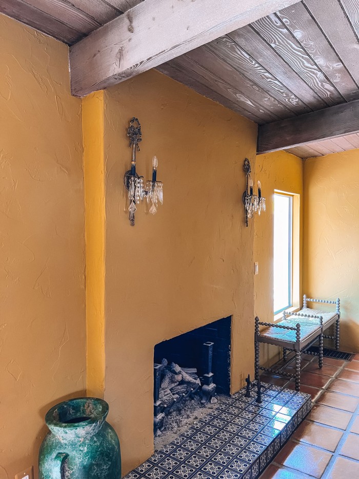
We ended up having some leftover tile from our kitchen projects and used it to retile the base of the fireplace!
I’m still in search of a large rug to center everything on. I think I will go with something neutral to balance the bold colors elsewhere.
Art in The Space
We purchased another of our favorite Frame TVs, and decided not to mount it over the fireplace. As a result, we’ll need some sort of art or mirror for over the fireplace. I haven’t quite figured that one out yet.
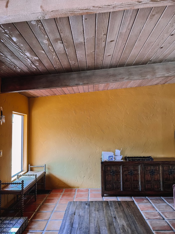
Additionally, we are debating between two gallery wall options in this space. First, we can incorporate the TV into a gallery wall like we did in our living room in LA. It would be on the far wall you see in the above photo. I should note, none of the furniture in these two photos is staying as is, so ignore that!
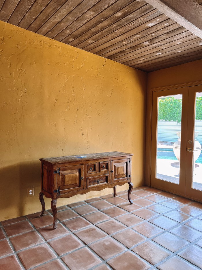
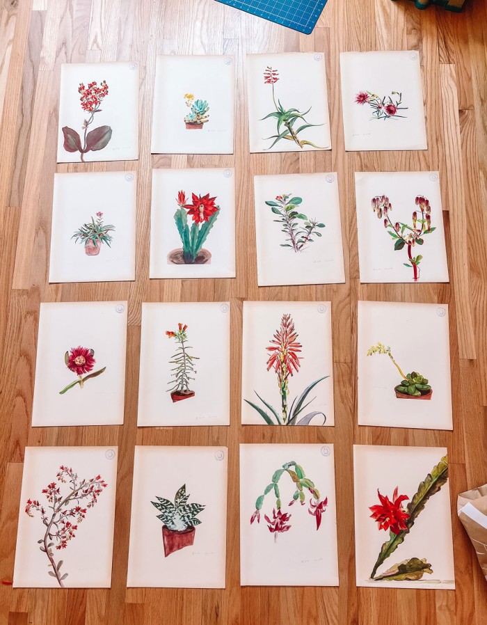
Or, we can just center the TV on the wall and then on the opposite wall (above) we can do a themed gallery wall of 1930s rock plant illustrations I found at the flea market. I think I’d add a long, narrow bench underneath.
Living Room To Do List
In addition to what I listed above, I’m hoping to carve out some space for perhaps another chair or a small side/game table. We also need to figure out some additional lighting for the space, as we currently only have those two sconces (that aren’t for sure staying, either!).
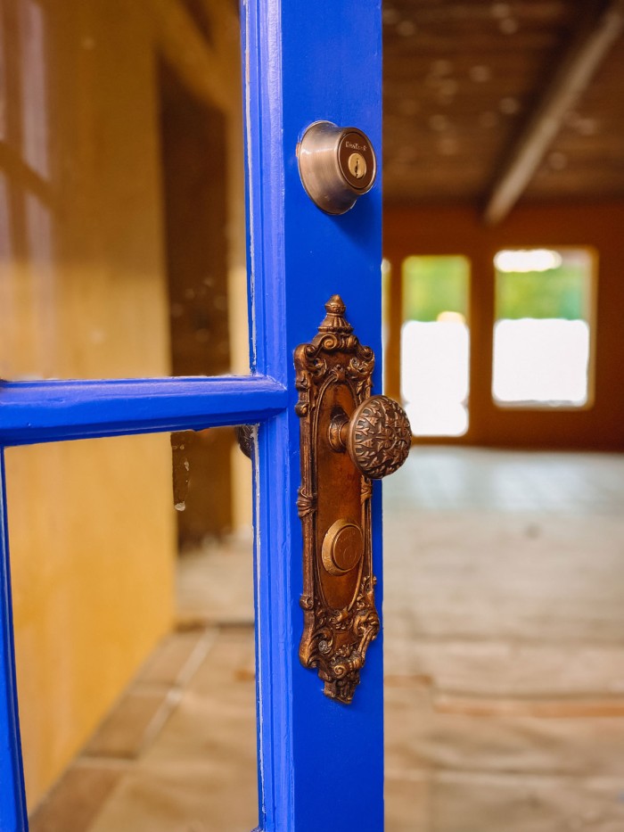
Lots to do, but I’m so excited. Here’s a final peek at the exterior door color we picked. Kinetic Energy by Dunn Edwards!
Stay tuned!
Thank you to Six Penny and Dunn Edwards for providing product for this project. All opinions are my own.



Leave a Reply