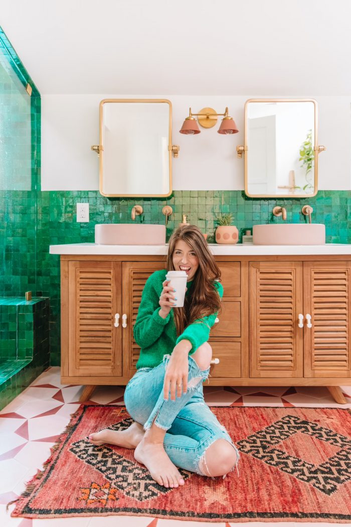
A few weeks back I shared a few of my biggest design regrets in our current home. Today I wanted to do the opposite and share my biggest design WINS! The things I love and would do again 10x over or in our next home.
While I hope to get the chance to explore other styles in our next home (I love so many!), these are all things I would absolutely love to do again no matter what. Here we go!
Using Zellige Tile
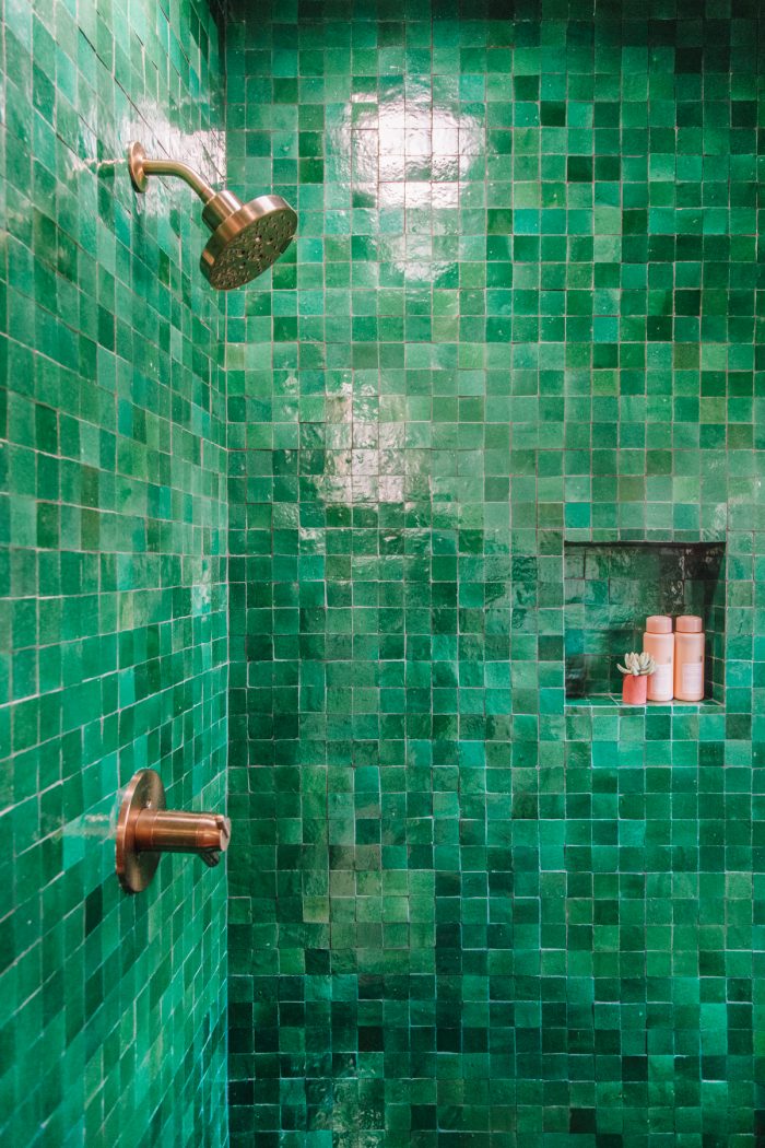
I could not love something more than I love zellige tile. That’s the handmade Moroccan tile we have in both our main bathroom and our kitchen. I love the texture and imperfections, I love the variations in color, I love that it doesn’t have large, or even perfectly aligned, grout joints. I. Love. It.
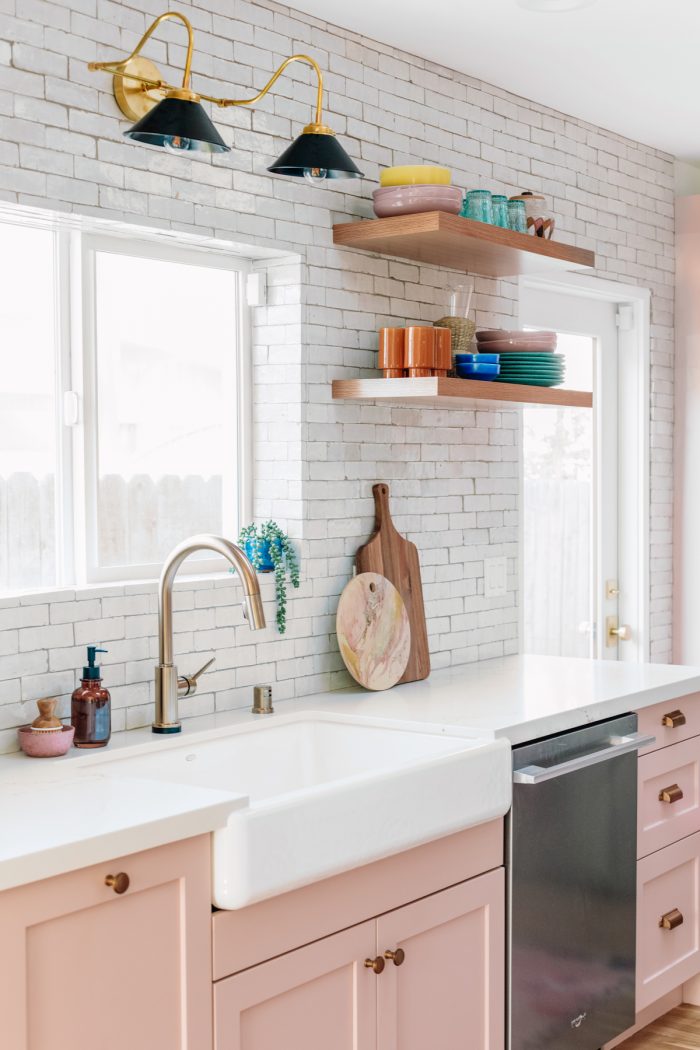
It is so special. It feels like it’s been in our home for centuries. I’d cover every wall in it if I could! I am also SO incredibly glad that we used a darker grout on all our tile, instead of something light/bright white. It only adds to the age and makes the grout lines even less noticeable. Hides the stains too. 😉
Investing in Custom Molding
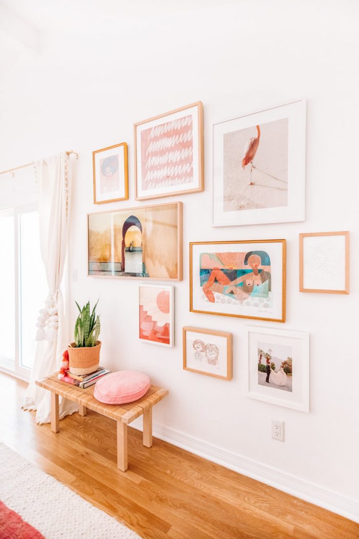
There were a few rooms in our house that needed new floors and molding as a result of some bizarre additions and renovations before we bought it. When the flooring team was discussing molding options with us, they showed us the standard options and then also mentioned that we could have the original molding from the rest of the house custom replicated.
They told us the price and it was expensive but ultimately we decided to invest the money in it and I’m so glad we were able to do so. The woodworking who did the custom match to the original said he’d been in the business for decades and had never seen the exact same molding we had, which likely means it was custom made originally for our home.
The design itself isn’t particularly fancy or special but the fact that we were able to carry this same small detail through all the rooms, both original and added on, has really helped tie the house together.
Opening the Kitchen to the Living Room
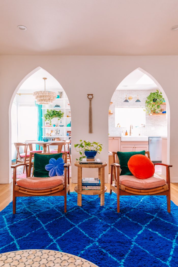
The previous owner of this house picked us because we told them we wanted to keep as much original character instead of completely gutting it like the investors we were up against. And we have tried so hard to stay true to that promise, despite doing heavy renovations to it to make it livable. (The toilet was falling into the floor when we bought it lol)
So after living in and realizing how much we disliked that the kitchen was completely walled off from the rest of the house, we really struggled to figure out how to open it without losing the arches, the molding, the original 1930s phone on the wall and more.
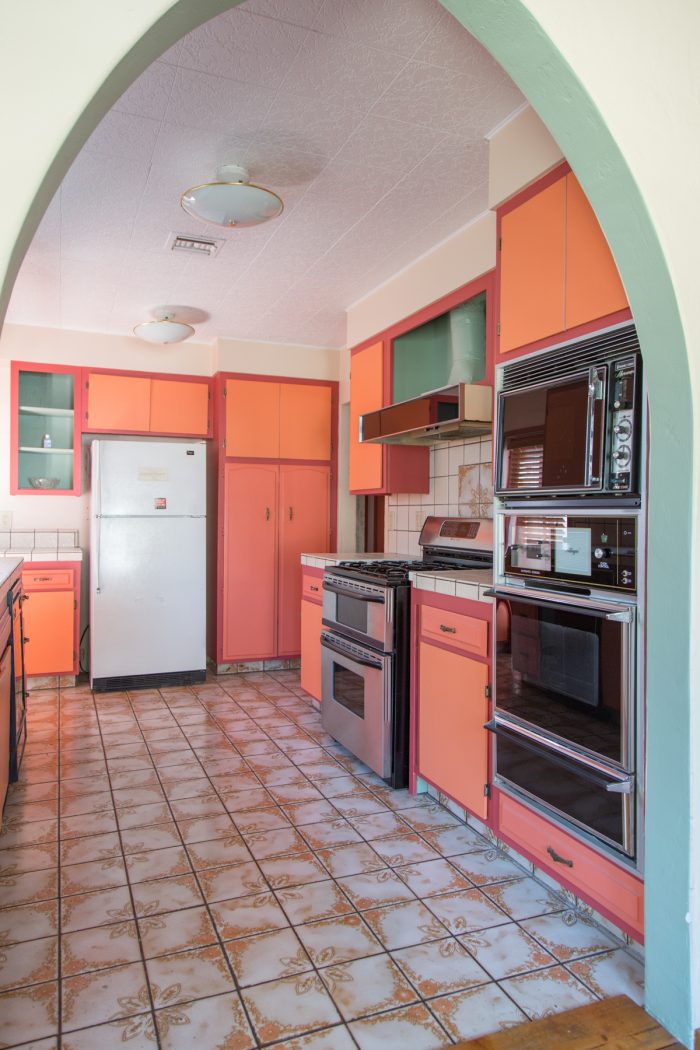
My cousin, who is an architect, suggested duplicating the arch to create an additional opening, almost creating a center point where the three arches would meet between living, dining and kitchen spaces. We loved the idea but were SO nervous because we’ve seen so many renovations where you can SO clearly tell which arches are new and which are original.
But our contractor KNOCKED it out of the park and I don’t know that anyone could tell which of the three arches is the new one. Having that additional opening made the flow of the house SO much better and practical for us with a little kid running around and it’s without a doubt the best decision we made.
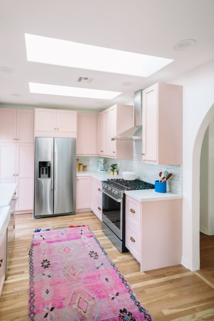
Old houses are often designed with a kitchen to be complete separate but I do think there are ways to open things up authentically to make it practical for families needs today!
Adding Skylights
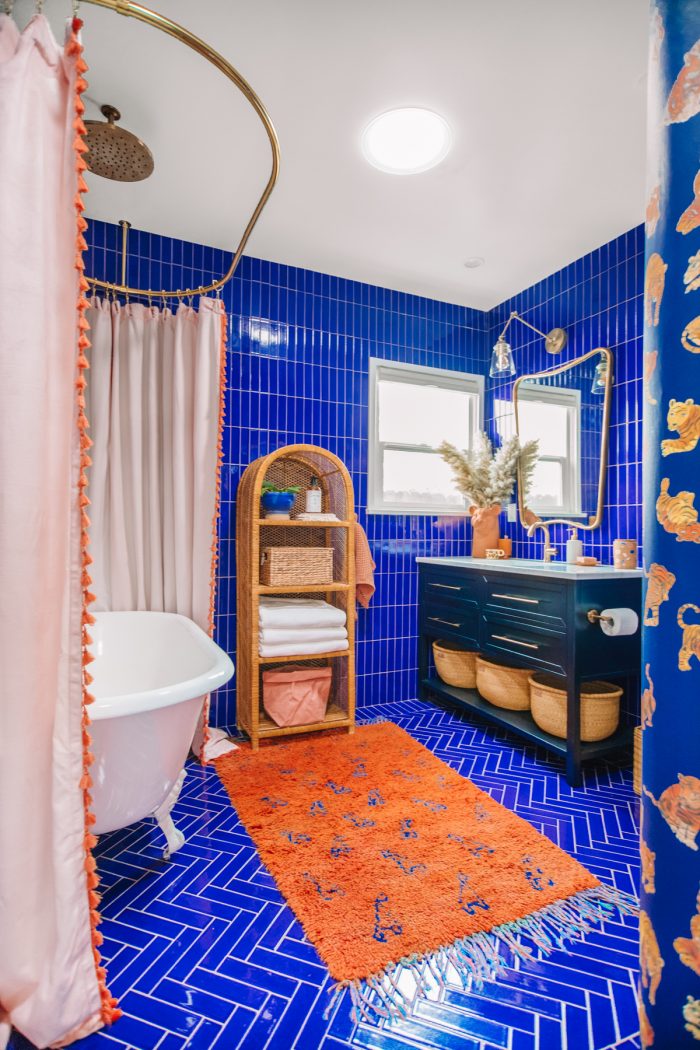
Adding skylights and sun tunnels to our kitchen, hallways and bathrooms completely transformed the spaces. The amount of light they brought it is incredible, we really don’t ever have to turn a light on in any room of our home during the day.
Natural light means a lot to us so this has felt like one of the best investments we’ve made, and also a very sustainable one since we were able to reduce our electricity use.
Turning A Kitchenette Into A Closet & Laundry Room
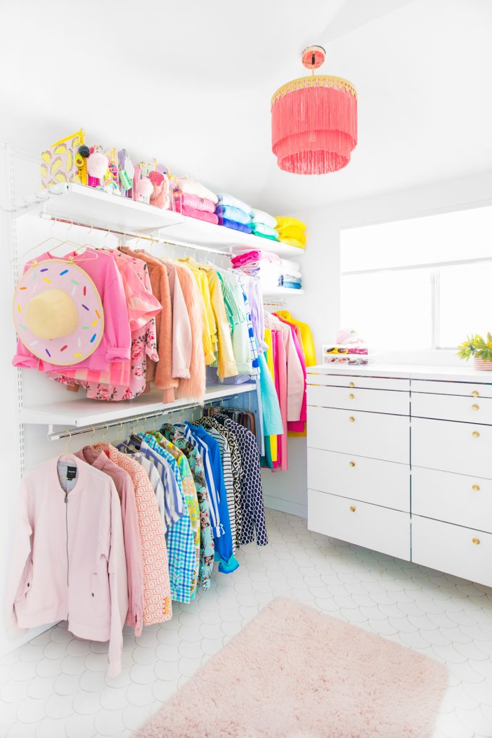
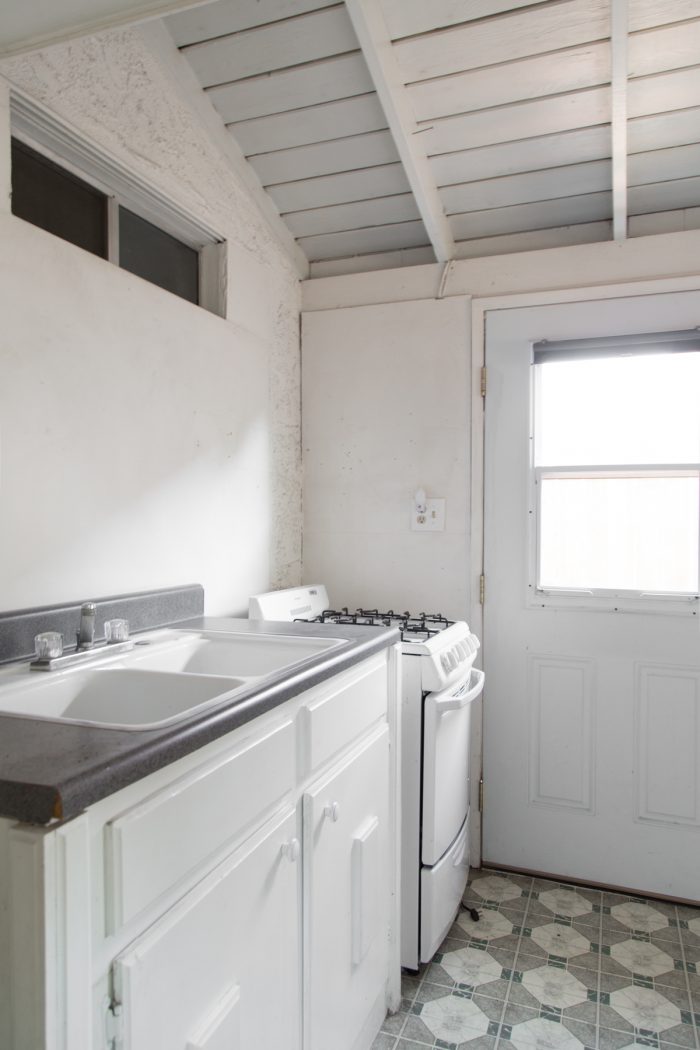
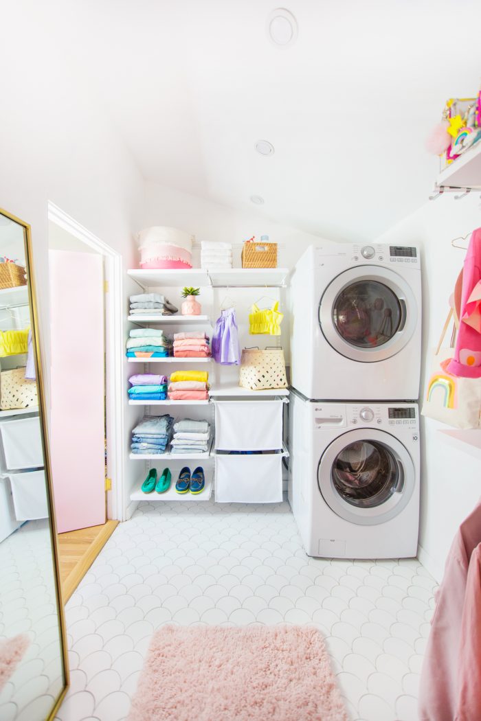
Our main bedroom suite used to be a rental unit before we bought this house, and one of the best decisions we made was converting the strange semi-outdoor kitchenette into a walk-in closet and laundry room combo. First of all, having laundry in your closet is SOOO convenient. And the closet in general was such an upgrade from the small sliding door closet the room previously had. Worth every penny!!!!
Finding My Perfect Lighting Company
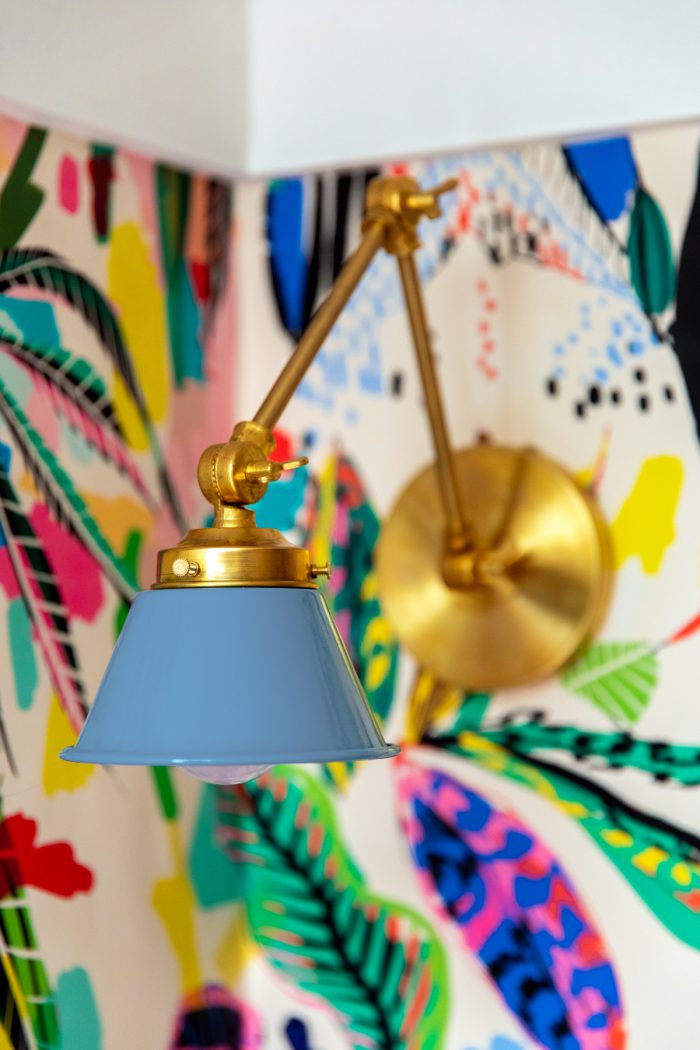
Finding and falling in love with Sazerac Stitches has been one of the most validating parts of decorating our home. I always say to Jeff, “I don’t think I’ll ever find a lighting company that is more perfectly me.” I should disclose that the company has gifted us several items for our home but I would pay for the fixtures 10x over. I LOVE the brass used, I love the style and shape of the fixtures, the color options. I love that the fixtures feel timeless, like they’ve been there forever but still fresh and new.
And I also love how customizable everything is. Two of the fixtures we had came out of me emailing and saying “Could I combine x with x and make xyz?” I could talk all the live long day about how much I love the lighting in our house. I’ve even considered swapping out the lights in our house before we take real estate photos some day so I can take the current fixtures with us. Haha!
Keeping Our Textured Walls
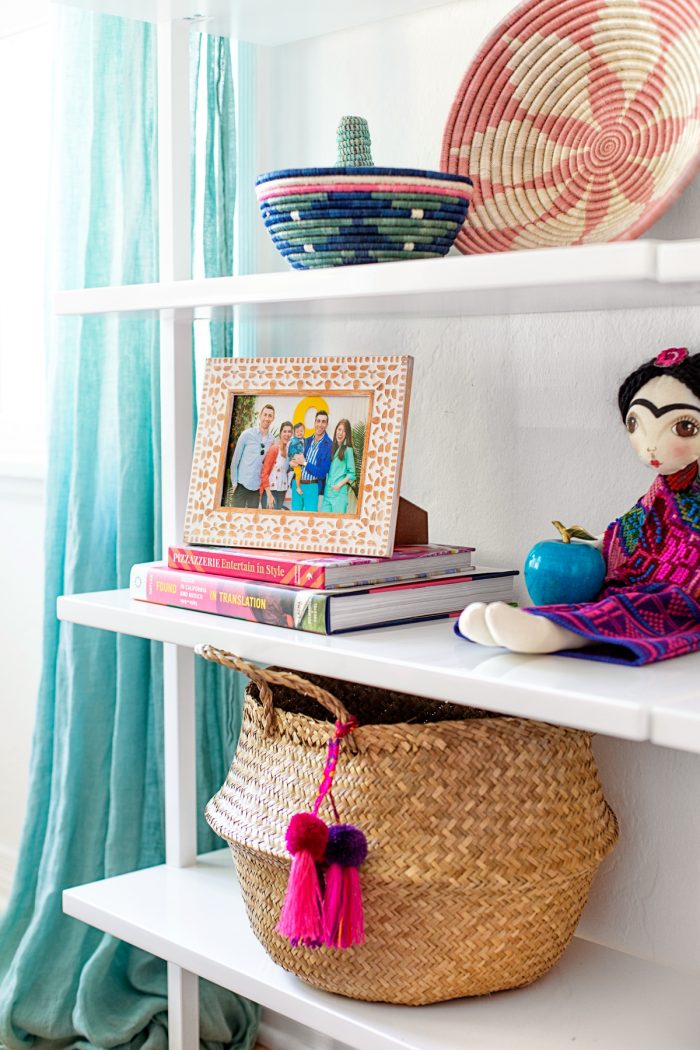
This will be controversial but… I love our textured walls! What I’ve noticed with most old houses that have been updated is that the walls are immediately smoothed out. People realllyyyy hate textured walls. But, we kept ours. Mostly because I wasn’t about to pay to smooth out our walls on top of all the other things we had to pay for to make this house livable.
But now, I really appreciate the texture!? It feels, to me, like it helps keep the age of the house in tact. I actually think adding the texture back into the new arch we added is one of the main reasons why it looks so authentic to the original home. In fact, I wish we continued the texture into the kitchen walls as well.
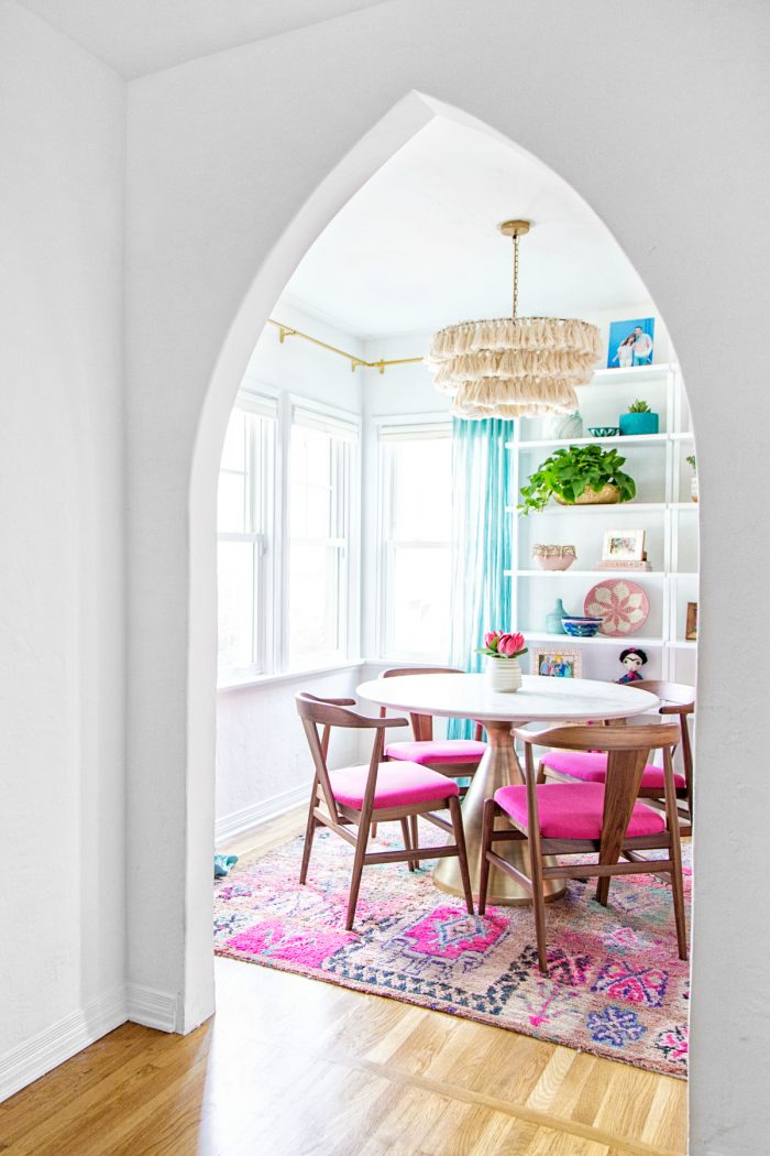
How do you feel about textured walls? Would love to hear!
Any major design WINS in your home? Something you’d do again and again?





Julie says
I am obsessed with this tile and adding it to my dream kitchen plan.
Also–I LOVE original detail, so glad you invested in keeping what you could!
Mia G says
Love all of these wins! None of them are too surprising either, haha! They were just SO GOOD! I agree about the arches – if you didn’t know which was original, it would be hard to guess!!
Regarding textured walls, I really don’t mind. They’ve been a pain while painting (so much easier to miss spots) but I don’t get the hate! Maybe if it’s extreme but to each their own, I guess!
Catherine says
Hi Kelly,
I recently purchased secret lagoon zellige tiles for my bathroom update and I was wondering what specific shade of grout you chose. I would love to know, thanks! Your home looks beautiful!!